Have you ever wondered why the same two yarns can weave into dramatically different colors of cloth? If you use two very different colors, like blue and orange, you might get anything from brilliant patches of blue and orange to disappointing mud – or anything in between.
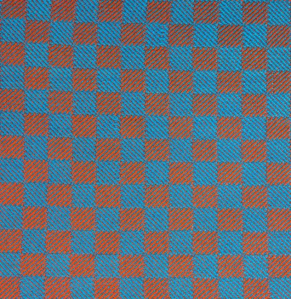
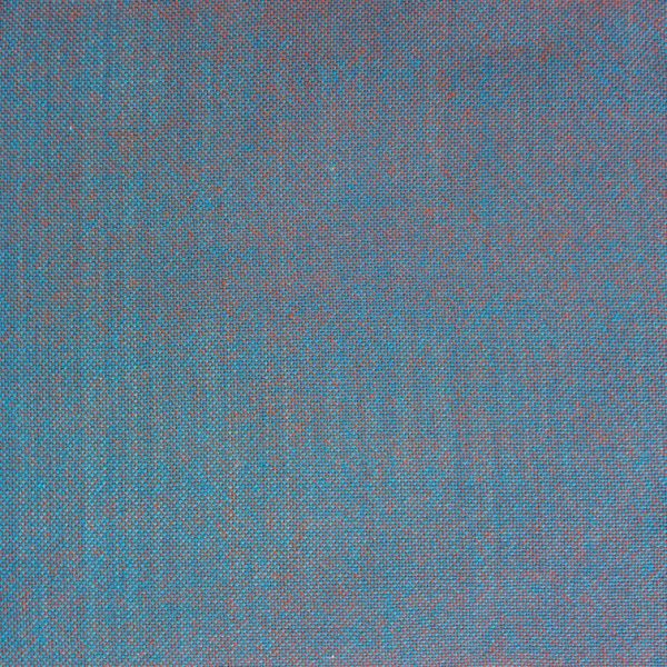
The secret is in your choice of draft. In this article, I’ll explain the three different kinds of drafts, their effects on color, and how to identify and work with each type of draft.
The three types of draft
There are three types of draft: blending drafts, which mix warp and weft colors together, separating drafts, which keep them largely separate, and partially blending drafts, which mix warp and weft colors together in some areas and separate them in others.
Blending drafts mix warp and weft colors together, so you need to worry about what colors the warp and weft will mix into. If you care about getting brightly colored finished cloth (you don’t have to!), you’ll want to follow the Two-Primary Rule, which I talk about in this blog post.
Separating drafts keep warp and weft colors largely separated. Unless warp or weft-faced, all cloth mixes warp and weft colors to some degree, but separating drafts consist of warp or weft-dominant areas with very few areas of evenly blended warp and weft. As a result, they keep the warp and weft colors relatively “pure,” and you don’t need to worry much about color mixing.
Partially blending drafts are drafts that don’t fit neatly into either category. Typically they have areas that are warp or weft dominant but also areas of evenly blended warp and weft. You do need to worry about color mixing, but not as much as in a blending draft, because the eye will tend to notice only the areas of brighter (non-blended) color and ignore the duller blended areas.
We’ll talk a bit more about each type of draft and how to recognize them.
Blending drafts
Blending drafts do just that – blend warp and weft colors together, evenly, in approximately equal proportions. They’re the weaver’s equivalent of taking two tubes of yarn “paint” and smooshing them together on the palette until they’re mixed into a single color that’s about 50-50 mix of the two colors. Maybe 60-40, but a pretty equal blend overall.
Blending drafts mix warp and weft colors by creating short floats of warp and weft in a ratio that is close to equal. This mixes the colors together fairly evenly – at a distance, blending drafts look like a solid color.
Plain weave is the ultimate blending draft, as it creates the shortest possible floats – over one and under one – and presents exactly equal amounts of warp and weft on each side. It blends warp and weft colors together as evenly as is possible for any weave structure.
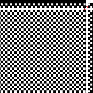
It’s important that the ratio between warp and weft be roughly equal. If either warp or weft dominate an area, creating a patch of color that is predominantly warp or predominantly weft, the dominant color stays “purer” and the colors don’t blend as much.
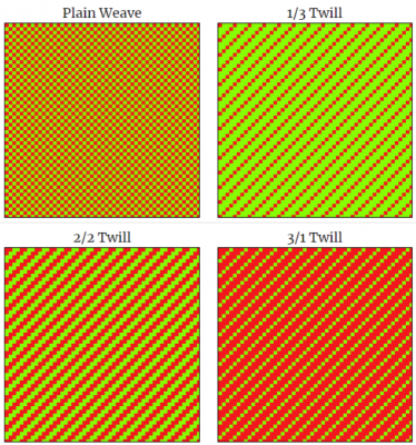
You can see that in these drafts. The plain weave and the 2/2 twill on the left side are blending drafts, mixing the colors in 50-50 ratios. The 1/3 and 3/1 twills on the right side mix the colors in 75-25 ratios, biasing the color mixes towards the original warp and weft colors, respectively. The colors stay brighter on the right side, because they have a higher percentage of the original colors.
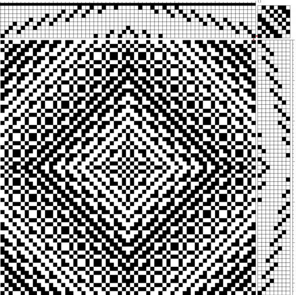
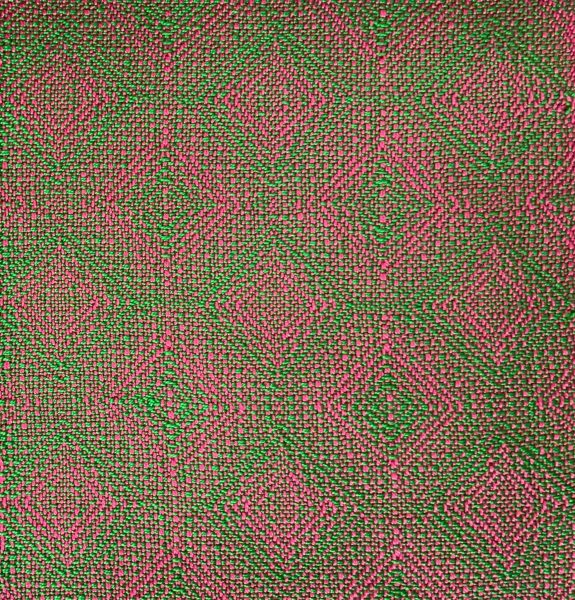
Here is another example of a blending draft, an advancing twill, and a swatch of cloth woven from it. Notice the short floats, the 50-50 mix between warp and weft, and how the colors blend together, producing a dull cloth overall.
Separating Drafts
Separating drafts are the opposite of blending drafts. Instead of smooshing them together and mixing them into a single color, they keep warp and weft colors relatively pure and separated from each other. Thus the name “separating draft”.
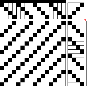
The key word is “relatively”. In weaving, except for warp and weft faced structures, there is always some warp or weft showing on the face of the cloth. So separating drafts are drafts that consist of warp-dominant and weft-dominant areas, with few to no areas where warp and weft are evenly blended together. Here are some examples of separating drafts:

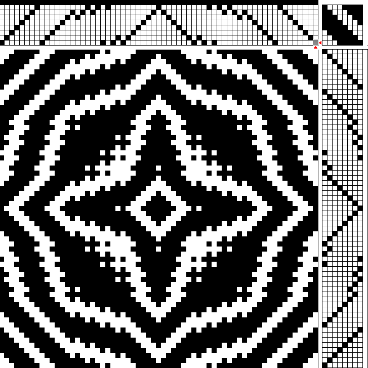
Here are the same green and magenta yarns as in the previous swatch, but woven using a separating draft rather than a blending draft:
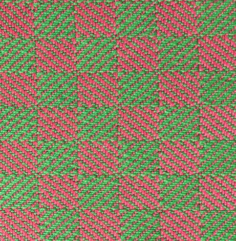
Notice how much brighter the colors appear!
Partially blending drafts
There are a lot of drafts that don’t fall into those nice neat categories. For example, this draft (3-3-1-1-1-1-1-1 twill) has areas that are warp dominant and areas that are weft dominant, but also have some areas that blend colors together evenly:
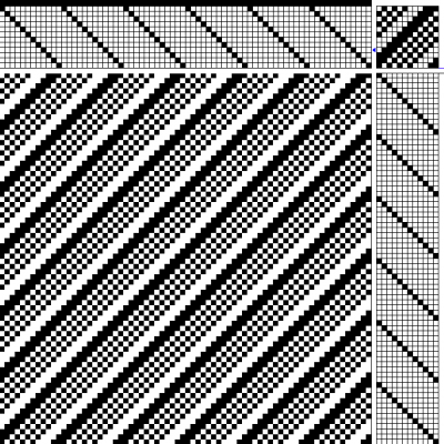
Because this draft blends colors in some areas but not others, it’s called a partially blending draft.
Overshot is a partially blending structure, as the larger areas of pattern and ground typically stay visually separate, while the half-tone areas blend pattern weft and ground cloth together:
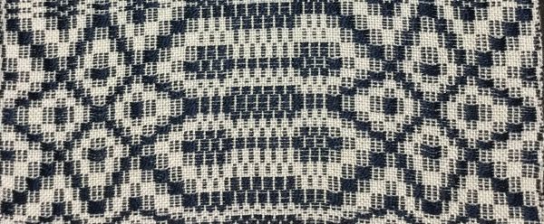
Photo copyright by (and courtesy of) Janet Dawson.
It’s difficult to generalize about partially blending drafts because they cover such a wide range of possibilities. They do contain elements of blended color, so if you want to mix colors and have the resulting cloth remain vibrant throughout, you’ll want to follow the Two Primary Rule when choosing colors, as outlined in this blog post.
However, because they also contain elements of brighter color, thanks to their separating-draft components, you don’t always have to follow the Two Primary Rule to have the cloth appear brightly colored. The eye is attracted to saturated colors, so if there are brighter and duller colors in cloth, the eye will notice the brightly colored parts and ignore the duller parts. As a result, even if the cloth has duller patches, the eye will only see the brighter parts.
Here’s an example. First, here’s the partially blending draft. It has some areas that are strongly warp dominant, and some areas that are strongly weft dominant, but also some sections in between, that mix warp and weft fairly evenly.
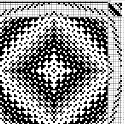
And here’s the fabric that’s woven from it – another magenta and green swatch.
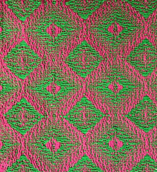
Notice how there are some areas of dull color in between the bright pink and the bright green areas. In fact, they make up about 1/4-1/3 of the cloth. If they made up the entire cloth, as it did in the blending draft, you’d notice the dull areas. But as it is, your eye is so busy looking at the bright pink and bright green areas that it doesn’t even notice the duller blended areas, so the cloth gives the impression of being brilliant pink and green!
Summary
How your yarn colors mix in your fabric is heavily influenced by what draft you choose.
There are three kinds of draft for color mixing in weaving: blending drafts, separating drafts, and partially blending drafts.
Blending drafts mix warp and weft colors together, so you have to consider how they will blend together when mixed. If you want brilliant colors in your cloth, you’ll need to follow the Two Primary Rule, as outlined in this blog post.
Separating drafts keep warp and weft colors separate, so you don’t have to worry about color mixing.
Partially blending drafts mix them in some areas and keep them separate in others. However, since the eye is drawn to bright colors and tends to ignore duller colors, you have to worry much less about muddy colors in color mixing in partially blending drafts than in blending drafts.
The concepts in this blog post are drawn from Make Your Colors Sing, my signature class on designing with color. If you want to know more about the class, you can get more information (and sign up to find out when I’m teaching the class again). Registration is closed; I am now teaching at Handweaving Academy.
Happy weaving,


Thanks for the clear explanation of the 3 different kinds of drafts where blending color is concerned. This post will be one I will refer to for future color weaving.
Thank you again for sharing your expertise. Eventually, I will be able to create a draft.
This is the best article I have read about using colors in weaving! I have just found your website and it will be a go-to every time I start a project. Thank you!
So glad to hear that! 🙂