One of the more interesting kinds of alternating thread gradients is the curved gradient, which creates the illusion of a three-dimensional fabric. It’s a type of gradient that you don’t see often, but it’s a very interesting one, so I thought I’d share details on it with you.
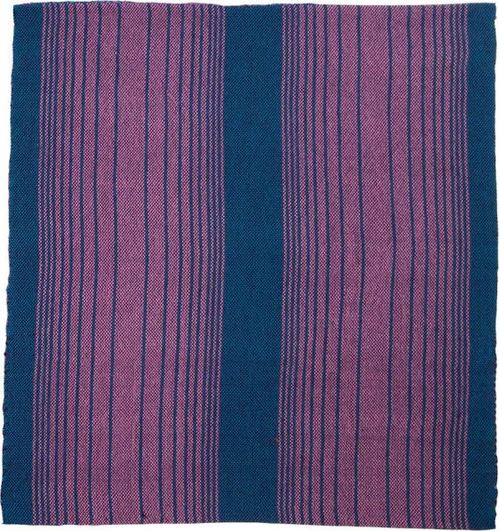
How they’re made
The simplest color gradients are made with two colors. They start off with pure Color A in the center, then change very gradually from Color A to Color B in the center area. Then, towards the edges, they change very quickly from Color A to about 50/50 Color A and Color B.
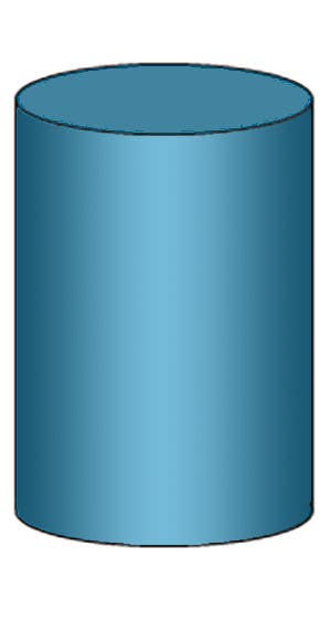
If there is a substantial difference in darkness between Color A and Color B, this mimics the look of a three-dimensional curve or cylinder:
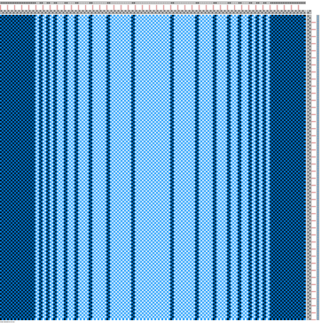
You create curved gradients by alternating units of Color A and Color B as shown – starting in the center with a broad expanse of Color A, then a very gradual introduction of Color B, and then about 2/3 of the way to the edge, rapidly changing to a 50/50 ratio of Color A to Color B. For a cylindrical curve, it usually looks best if you end at a 1:1 ratio of Color A to Color B to give a sharp transition at the edge.
The units can be any number of threads; in this sample, the units are two threads wide.
Why use a unit of more than one thread, if units of one thread give the smoothest gradient? It has to do with the structure.
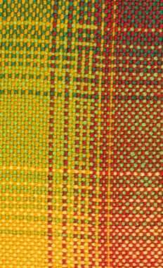
For example, if you are using plain weave, a unit of one thread can potentially create “railroading,” a phenomenon where three-thread “stripes” of color appear crossing a single-thread stripe if one warp and the weft are similar colors.
You can also get “log cabin” color-and-weave patterns if using a double gradient, as visible in the swatch below. This is why a multiple-thread unit can be useful in some structures.
(This and many other topics related to designing gradients are covered in the class Gorgeous Gradients. Note: Registration is closed for all my courses; I am now teaching at Handweaving Academy.)
Contrast in curved gradients – subtle or dramatic?
To get the most “curve” from your curved gradient, you’ll want to use warp yarns with lots of value contrast – that is, with strong light/dark contrast between the two yarns.
Here’s a curved gradient in white and light gray, with a medium gray weft:
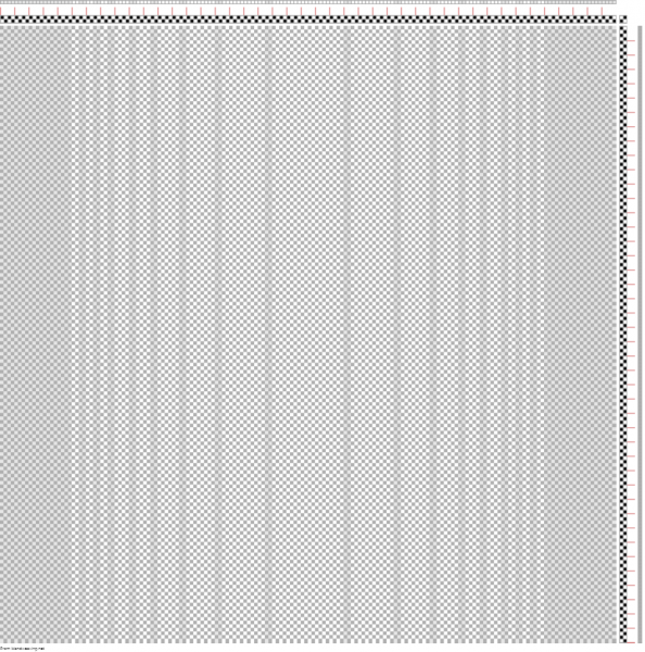
This gradient is very subtle, and feels almost “flat”.
Here’s how the curved gradient looks with a black and white warp and a black weft (which makes for one of the most dramatic gradients possible):
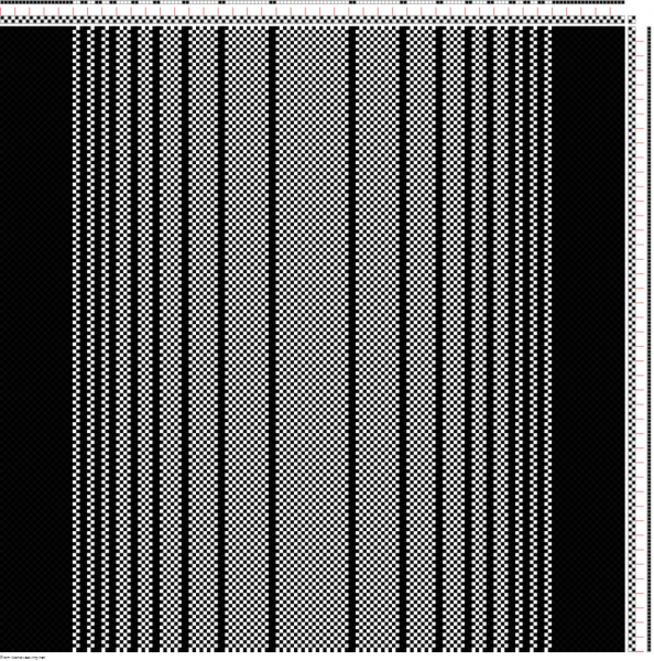
There’s a distinctly three-dimensional feel to this gradient.
You can create curved gradients in multiple colors as well. Here’s one that uses multiple colors, that gradually get darker near the edges, to enhance the gradient.
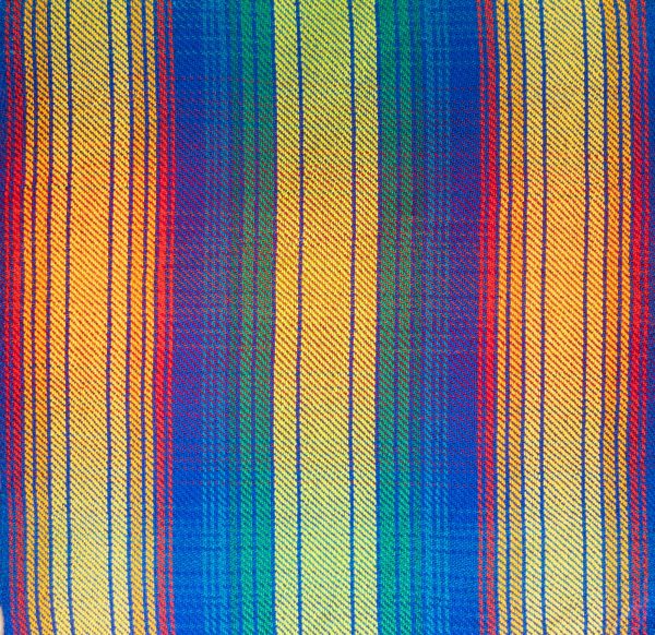
This swatch is actually a reversible gradient – a double gradient (gradient in warp and weft) that looks completely different on the reverse side! Here’s the back side:
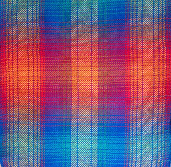
Yep, we’ll be covering that in Gorgeous Gradients, too. Registration opens August 30.
Happy weaving,


I am hoping to set this idea up on my rigid heddle loom which has been neglected of late A nice idea for the winter.!