When we’re considering color for our handwoven cloth, we often just ask, “What colors should I use?” But there is so much more to designing with color than choosing a yarn palette. This post offers five key questions that will help you design gorgeous cloth, and suggests ways to answer those questions.
Key #1: Do I have enough light/dark contrast to make my pattern show?
Value contrast (light/dark contrast) is the most important factor in determining whether a pattern will be bold or subtle. If you want a subtle pattern, choose warp and weft colors that are about equally dark; if you want a bold pattern, choose warp and weft colors that are very different in darkness. (To learn more about how and why this works, check out this blog post.)
An easy way to figure out how much light/dark contrast there is between your yarns is by snapping a photo of them in black and white. Here’s a photo that shows three yarns in black and white, and in color:
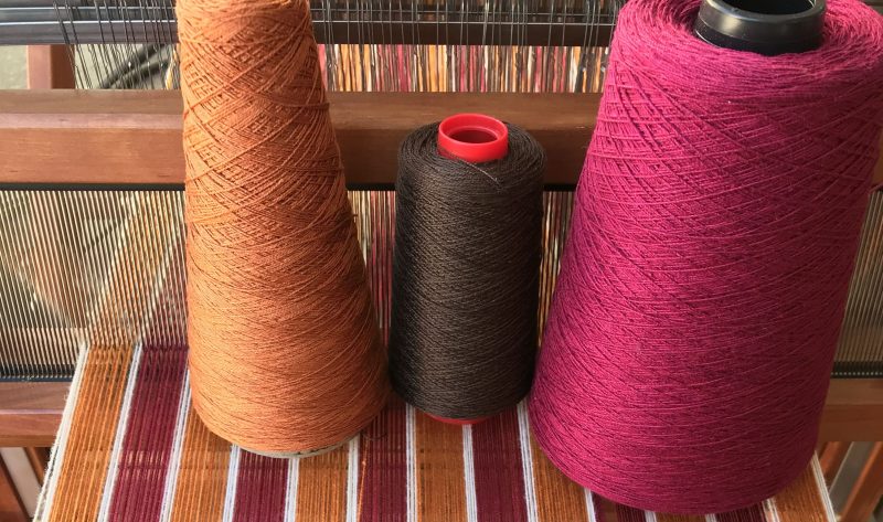
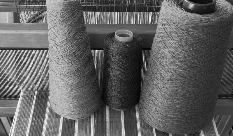
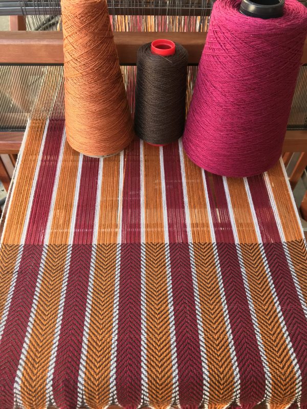
Looking at these yarns in black and white, you can see that there’s more value contrast between the gold and brown yarns than between the burgundy and brown yarns, so you’d expect the gold yarn to create a bold pattern and the burgundy yarn to create a subtle pattern when woven with the brown weft. And, in fact, that’s exactly what happens:
To learn more about why and how to use black and white photos, check out this post on top seven color tools for the handweaver – the black and white photo is tool #1!
Key #2: Does my draft blend or separate colors?
Not all drafts are created alike. Some drafts will blend colors, others will keep them separate. The distinction is critical, and can make the difference between bright colors and a dull mix. The swatches below are woven with the exact same yarns – but one swatch blends the green and magenta yarns together in plain weave, while the other keeps the colors mostly separate in blocks of 1/3 and 3/1 twill:
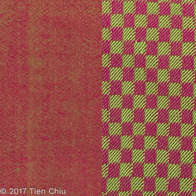
If your draft keeps the colors separate, you need only consider how the colors will look next to each other. But if your draft blends colors, you’ll want to think carefully about how your colors will mix.
Key #3: What colors will my warp and weft create when woven?
Handwoven cloth is always a blend of warp and weft colors. If your draft tends to keep colors separate, with heavily warp-dominant areas and heavily weft-dominant areas, then you’ll have to worry less about color mixing because your colors will stay relatively “pure”. If your draft tends to mix colors – plain weave, twill, huck lace, etc. – then you’ll want to think about how the colors will blend.
Colors that fall between two primary colors on the color wheel will typically blend into equally bright colors; colors that sit on opposite sides of a primary color will blend into duller ones.
I explain in detail how this works, and how to select colors that blend into brighter or duller colors (as you prefer), in this blog post about color mixing.
To see how your selected yarn colors will blend I’ve developed a great online tool for you. The Warp & Weave Color Mixer is superb for testing color mixes – just upload photos of your yarns and click to select warp and weft colors (or use the manual color picker), and it will show you how the colors will blend together in a variety of weave structures and at different scales. You can access the Warp & Weave Color Mixer here.
Key #4: How much of each color should I use?
Some colors can be a challenge to use because they are extremely eye-catching and tend to take over. Other colors contrast strongly and can be too powerful in combination for some tastes – i.e., you might feel like they clash.
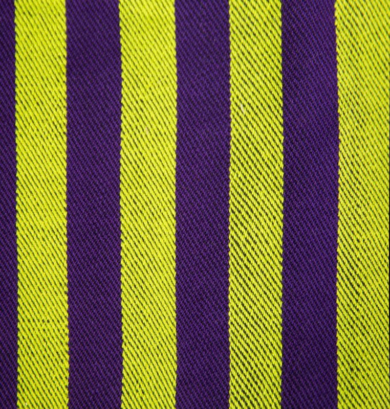
Most of the time, these “problems” aren’t problems with the colors themselves. You can use almost any palette of colors effectively if you use the right amount of each color. For example, in this swatch, the screaming yellow-green dominates the swatch, because yellow-green is a very assertive color, especially compared to dull purple.
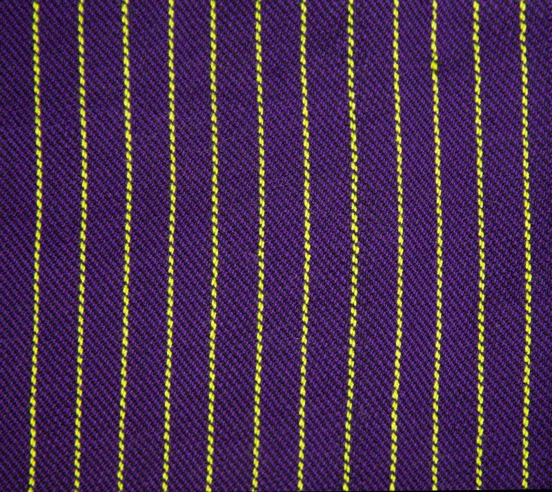
But in this swatch, there is much less yellow-green, and the swatch feels more balanced. The colors are the same – only the proportions are different.
This blog post talks more about how to balance proportions when one color is more assertive than another.
One great way to figure out what proportions of each color to use is to use a yarn wrap. Simply wrap stripes of yarn around a card until you have an arrangement of colors (and proportions) that you like.
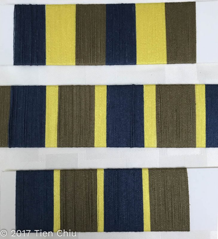
Obviously wraps work best for testing stripes, but they can also give you an idea of general color proportions. (Here’s a great blog post about designing using yarn wraps and handling clashing colors.)
Key #5: How will the colors blend in the actual cloth?
The last question in designing with color, of course, is how the colors will blend in the actual cloth. This can be a difficult (and expensive!) question to answer, and it’s best to answer it in stages as you progress through your design process. Initially, a quick sketch of the cloth or the project to give you the overall layout of the colors may be enough. Here’s a concept sketch for my piece Autumn Splendor:
It shows the rough layout of the colors.
As you choose a draft and select colors, it can be very helpful to simulate the finished piece – particularly for complex designs with many color changes. Weaving software can be an excellent tool for this, allowing you to try many combinations of drafts and colors quickly and easily.
If you are on a budget and have a tablet, consider iWeaveIt – it’s considerably less expensive than desktop weaving software, runs on iOS and Android tablets (and smartphones), and allows editing colors. You can zoom in and out to see your entire draft (albeit smaller than on a full-size monitor), and edit the color palette to match your yarn colors. You can quickly change out all instances of a given color by editing that color in the color palette.
When using weaving software to simulate your fabric, remember to view the draft at the same scale at which you’d see the finished fabric. It’s very easy to zoom in on a draft and forget that the finished fabric will be seen at a much smaller scale, which will affect color blending. (More about the effects of scale in this blog post.)
The final test of how a piece will look in the finished fabric, of course, is to weave a physical sample. Many people recommend sampling as the first or only test of a design. I feel it should be the final test, the last of many – because a physical sample is so expensive to create. You have to warp the loom, committing a lot of time and materials to creating the sample. So before creating it, you want to exhaust all your other options for testing first.
At the same time, however, there is no substitute for weaving a physical sample, because only a physical sample will tell you how the yarns will look in the finished fabric. Colors do not look the same as light radiating from a monitor as they do in physical objects, and yarns look different in wet-finished fabric than they do on the loom! So a physical sample is valuable, especially if you are weaving yardage for a large project.
And that’s it! Five questions you should ask yourself when designing with color, and some ways to answer them. I hope you’ve found this post helpful.
Happy weaving,

If you want to know more about how to create crisp, clear designs in your handwoven cloth, subscribe to my newsletter and get my FREE e-book! It will help you design beautiful handwoven fabrics, with a pattern as bold or subtle as you want.


Thanks for the great info. I think your first 2 photos are covering up some text.
Thanks for letting me know! I think I fixed it, let me know if it’s still a problem.
Thanks. Very helpful.
Wish I had found you earlier in my weaving career of over fifty years, but still learning.
Thank you so much for the valuable information in this article, and the great color mixing tool! I can hardly wait to read the other articles you sent. I love all colors, and finding new ways to put them together. I am excited to use what I’m learning from you and to be able to plan better and know more about how my weaving will turn out, instead of being surprised. Surprises are fun, but knowledge is so satisfying. Thank you, thank you! Your cloth is gorgeous! So happy I found you on Pinterest.
I am so happy I found you! I am a disaster with color – so I’ve been copying pictures and patterns. I am so tired of copying! I am looking forward to learning from you – and excited to work on my own designs for a change. Many Thanks!
So glad to hear that this was helpful, Tess!