One of the most wonderful things about teaching the Discover Color Weave-Along was getting to see the amazing things my students wove. They’re gorgeous!! I’ve loved the creativity and beauty that have been coming off the looms. I thought I’d share one of the rugs today, and talk about some of the techniques from Discover Color that the maker, Eileen Baker, used to design it.
Eileen’s mug rug
Here’s a beautiful mug rug by Eileen Baker:
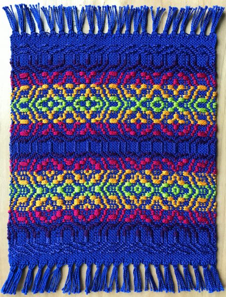
It uses the Knots and Crosses design from the Discover Color Weave-Along. In black and white, a the original drawdown looks like this:
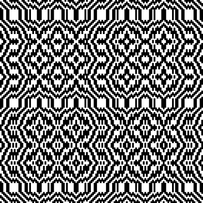
Eileen’s rug looks very different, because she chose the colors to create a different set of motifs. Yes, you can do that with your choice of colors! By choosing colors that draw attention to specific areas of your rug, you can emphasize some areas of a design and de-emphasize others, and that’s exactly what she did. (This is covered in Discover Color. Registration is closed; I am now teaching at Handweaving Academy.)
How to create motifs
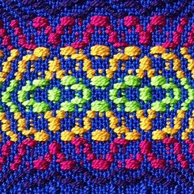
The eye gravitates to light colors and to saturated colors (read more about that in this blog post). In Eileen’s mug rug, all the colors are very saturated – brilliant blue, bright yellow, lime green – no dull colors here! But the yellow and the lime green are much lighter than the magenta, which is much lighter than the purple and the cobalt blue. The lighter colors attract the eye.
When you look at Eileen’s mug rug, the yellow and lime green jump out at you because they are so much lighter. As a result, you mostly see those portions of the design. So instead of the four stars in the top left that you see in the black-and-white draft, you see a pair of circles and stars instead, the part highlighted by the lighter colors.
How to create harmony through color arrangement
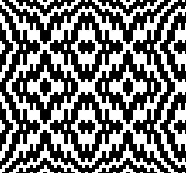
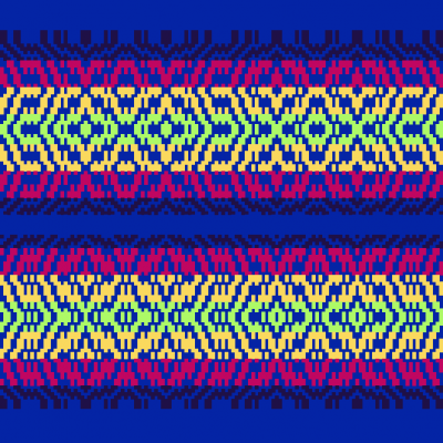
Eileen has also used a nice assortment of colors, and she’s arranged them in a way that makes the colors feel harmonious even though they cover a lot of the color wheel. To see how much difference her choice of color order made, consider what would happen if she had chosen a different order. Here’s a simulation of her mug rug draft:
Here’s what the mug rug would have looked like if she had swapped the lime green and the dark purple:
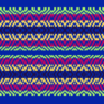
Whoa! What a difference! Just from swapping two colors.
The difference comes because there is suddenly much more contrast between adjacent colors than there is in Eileen’s piece. Yellow and dark purple are radically different colors – near-opposites on the color wheel (high hue contrast), plus one is very light and the other very dark. Similarly, lime green and magenta-red are near opposites on the color wheel and very different in darkness. Now, instead of a nice orderly progression from light to dark and around the color wheel, the eye is presented with a series of high-contrast stripes. So Eileen’s choice of colors is important, and has made a huge difference. The result is a much more harmonious-feeling rug.
That’s it for today! In my next blog post, I’ll share another gorgeous mug rug, and show how another of our Discover Color participants has used color to design beauty.
Happy weaving!

If you want to know more about how to create crisp, clear designs in your handwoven cloth, subscribe to my newsletter and get my FREE e-book! It will help you design beautiful handwoven fabrics, with a pattern as bold or subtle as you want.

Love how you describe this so succinctly. Great to have the mug rug simulations to see the difference.
Hi Tien,
I really found this helpful ! What a great idea!
Thank you
Cathy
Thanks Tien for giving us some more insight into how the color works in this mug rug. I am just working on the last of my warp. I have enjoyed this class very much. Thanks!!
Thank you so muce h
Beautiful! Thank you for sharing. Excited to see the next example.
This is very valuable Tien. I can see when color, design, pattern and materials work well together but I can't say why….yet that is!
Thank you for doing this.