Early in my weaving career, I was advised to use black wefts with brightly colored warps, because “black pops all colors”. But I quickly found out that that wasn’t true. Sometimes the colors came out clear and bright, other times they turned into mud. If that’s ever happened to you, fear not. There are two secrets for using black to make your handwoven cloth sing, and this post will teach you both of them.
Secret #1: Use a weave structure that gives you large chunks of color.
To understand why big patches of color are important, let’s start by looking at a design that does “pop”. Here’s a sample of handwoven cloth- orange woven with black in 1/3 vs. 3/1 twill blocks:
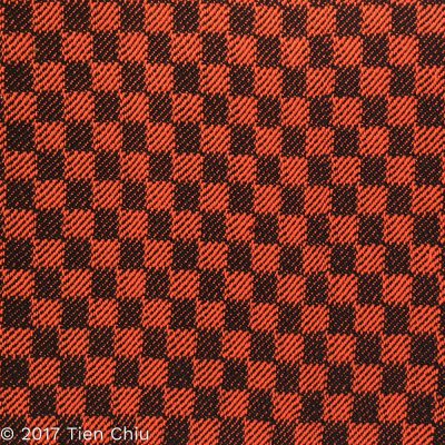
The pattern stands out clearly, and the orange looks bright against the block.
But if you weave orange and black in plain weave, here’s what you get:
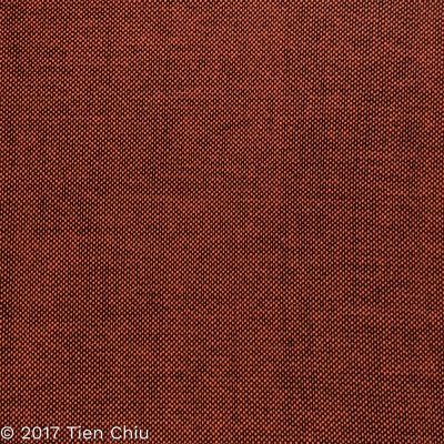
The orange is practically invisible, and the cloth is a dull, dingy brown.
So what’s happening here? There are two color principles at work. In the first sample, simultaneous contrast makes the orange look bright against the black. In the second, optical mixing blurs the two colors together, producing a muddy brown. So the orange comes out bright in one combination, dull in the other.
Simultaneous contrast
The first sample’s colors appear bright and clear. This is because two colors placed next to each other will tend to emphasize their differences. If you place a patch of dark color next to a patch of a light color, the dark color will look darker, and the light color will look lighter. Similarly, a dull color placed next to a bright color will make the dull color appear duller and the bright color appear brighter. This principle is called “simultaneous contrast”.
Since black is both the dullest and darkest possible color, putting a patch of any other color next to a patch of black will make that color look both lighter and brighter than it is.
Here’s a patch of orange , the same color as the original yarn:

And here it is set against both black and white:
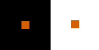
If you stare at the black-and-orange block for a few seconds, and then the white-and-orange block, you can see that the orange looks lighter against the black background than it does than against the white. The longer you look, the more obvious the effect will become.
Because the eye is attracted to both light colors and bright colors, the patches of orange appear more prominent against the black than they would against any other color. The black “pops” the orange.
So if that’s true, why does the black-and-orange plain weave look dull and boring? That’s because of the second color principle: Optical mixing.
Optical Mixing
If patches of color are small enough, the eye will average them into a mix of the colors. This is called “optical mixing”. Plain weave produces many small dots of color, so the eye blends the black and orange together into a mix of the colors – producing brown.
Here’s the plain weave sample again:

And here’s a color card showing the colors you get when you mix orange and black:
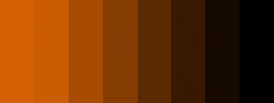
Plain weave is a 50-50 blend of warp and weft, so it’s not surprising that the “averaged” color comes out near the middle of the color card – a dull brown.
So that’s why black gives more pizzazz to colors in some weave structures but dulls them down in others. In large patches, it will make your colors look brighter and lighter. But in small patches, it will darken and dull them. So if you want black to make your colors sing, choose a weave structure that makes your patches of color big enough to see.
Secret #2: Use black with light to medium shades, not dark colors
Even in large chunks, black does not “pop” all colors. Dark colors won’t contrast well with black, while light to medium colors will. So black works well with this green, which is a medium shade:
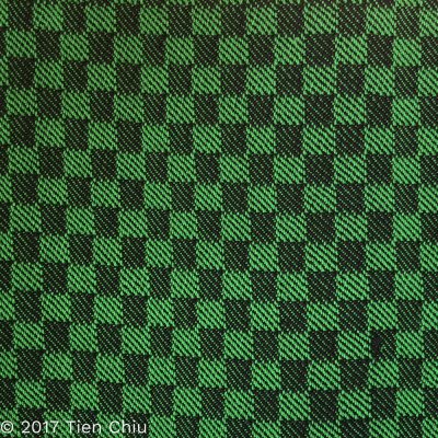
But it does not work when woven with dark purple, even though the patches are the same size:
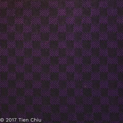
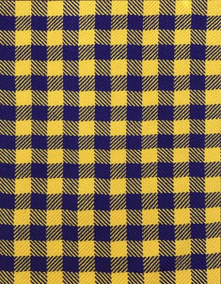
That’s because the dark purple is almost as dark as black, so the eye can’t clearly separate the two colors. (More about this in my blog post about why bright colors can weave into dull projects.) So a dark color will be much more vivid and beautiful when placed against white, pale gray, or any light color, such as this yellow:
And that’s it! To recap, here are the two secrets for using black to “pop” a color:
- Use large patches of color against large patches of black. Mixing them in small dots will blend the colors together, darkening and dulling your color.
- Use a light to medium color. A dark color will blend with the black regardless of weave structure.
If you want to know more about how to create crisp, clear designs in your handwoven cloth, subscribe to my newsletter and get my FREE e-book! It will help you design beautiful handwoven fabrics, with a pattern as bold or subtle as you want. (If you’re already subscribed, just register again – you won’t get double the email, I promise!)
Happy weaving!
– Tien


Tien,
You’ve said this more clearly than I’ve ever heard before–Good on you!
Thanks, Peggy!
I love your thorough explanations and visuals so much! This makes so much sense and yet felt completely new to me. I’m excited about your new ventures in sharing your vast knowledge.
Very clear and visual explanation. Thanks !
Clearly said. It will also help me with dying fiber and yarn. Thank you.
Hi Tien! I enjoyed this blog post. Two things stood out to me. I have made almost exactly your dark purple and black sample in a zephyr/qiviut scarf. I knew it would be subtle, but it was way more subtle than I expected. That scarf will not be sold, but I won't mind owning it. Don't think I'll make that (expensive) mistake again, thanks to you!
Also, I think your simultaneous contrast discussion clarified what goes on in these qiviut/Zephyr scarves. The qiviut is always duller than the Zephyr, first because of the quality of the qiviut being duller and fuzzier than the silk/wool zephyr. And then in the stash busting weave along, my black qiviut was even duller, and the zephyr yarns looked brighter in comparison.
So great knowing these principles, and starting to use them.
Thank you!
Glad you found it helpful, Celia! 🙂