Color mixing in weaving can seem mysterious. But it really isn’t. You can break it down logically, into just three elements. They are: your yarn colors, the draft, and the size of your pattern. I’m currently teaching about this in the free Discover Color Weave-Along (Registration is closed; I am now teaching at Handweaving Academy) …here’s a sneak preview of an upcoming lesson from the Weave-Along!
Color mixing in weaving sounds complicated, but I’ll break it down for you. Once you understand it, everything will fall into place!
Weaving is like painting
Weaving is like painting, and your yarn colors are like tubes of paint. Your yarn colors are a starting point, not the final colors of the cloth.
Weavers tend to spend most of their time picking out yarn colors, thinking they will be the final colors of their piece. Most weaving, though, is a blend of warp and weft colors, and the choice of draft is just as important as the starting palette. If your yarn colors are like tubes of paint, your draft is the brush, mixing the yarn colors and determining where each will be placed on the canvas of your handwoven cloth.
Color Mixing Factor #1: Yarn colors
The most obvious factor in color mixing in weaving is your yarn colors. They determine what colors you can mix, and thus what colors you can potentially create. If your yarns are yellow and red, you can mix any blend of red and yellow that you like, but you cannot weave blue cloth!
Weavers often focus exclusively on the colors of their yarns when thinking about color in their project. If the project comes out disappointingly dull, they think they picked the wrong yarn colors. This is often not the problem at all! That’s because there is another, very important, factor involved…
Color Mixing Factor #2: The draft
Your draft determines how the colors will mix. In painting, if you start with red and green paint, you can get bright red and green, if you dab the colors on separately. But if you put them on the palette and mix them together with the brush, you’ll get grayish brown.
Similarly, if your draft blends warp and weft evenly together, in small floats, as plain weave does, then the colors will mix together. If the draft produces large weft-dominant areas and large warp-dominant areas, then it will tend to keep warp and weft colors “pure”. This can produce startlingly different looks.
These two swatches are woven with exactly the same yarns – green and magenta. However, one is woven in plain weave, blending the colors, while the other is woven in 1/3 vs. 3/1 twill blocks, placing warp-dominant areas next to weft-dominant areas and keeping the colors relatively “pure”. What a difference!
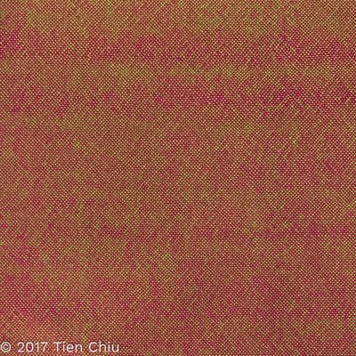
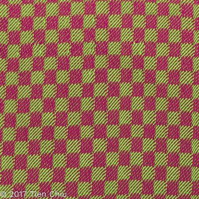
So when thinking about your project, it’s critical to think not only about the yarn colors you’re using, but also about what draft. If your colors are blending into mud, then choosing a draft that doesn’t mix colors can make a critical difference.
What kinds of drafts mix warp and weft colors?
Drafts with lots of short warp and weft floats scattered evenly throughout the fabric will tend to mix colors. The shorter the floats and the more balanced between warp and weft floats, the more the colors will mix.
Example: Plain weave and its close relatives (huck lace and most plain weave based lace weaves) all tend to mix colors. 2-2 twill and 2-2 broken twill both mix warp and weft colors, though not as much as plain weave.
What kinds of drafts separate warp and weft colors?
Drafts that separate warp and weft colors feature longer floats of either warp or weft, lined up together to create areas that are heavily warp or weft dominant. Examples include 1/3 vs. 3/1 twill stripes or blocks.
Color Mixing Factor #3: Pattern size
The third factor in color mixing is the size of your woven pattern, and it makes a big difference. That’s because your eye blends together small dots of color, but leaves bigger patches separate (and even emphasizes their differences).
(More on how and why this works in this Warp & Weave color article.)
The Impressionists used this principle in their painting by putting lots of small dots of color in their paintings and letting them blend together when viewed at a distance. In Monet’s painting “Haystacks,” the light purple area near the bottom left of the haystack appears to be a solid color:
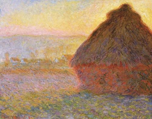
But if you zoom in and look closely at the painting, it turns out to be a lot of small dots of color:
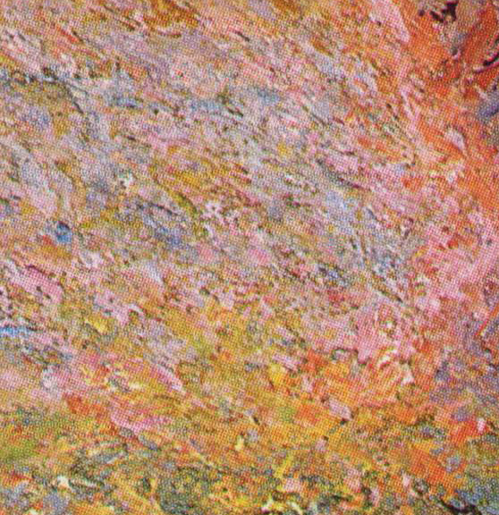
Weaving is like painting in this way as well. You can see this principle (called “optical mixing”) at work in these two swatches. Both are woven in the same colors, yellow and blue-purple, but one is woven in 20/2 cotton (a fine yarn) and the other is woven in worsted-weight wool yarns. The dots of color are much smaller in the 20/2 cotton yarn, so the colors blend together more than in the swatch woven with thicker yarns, producing larger dots of color.
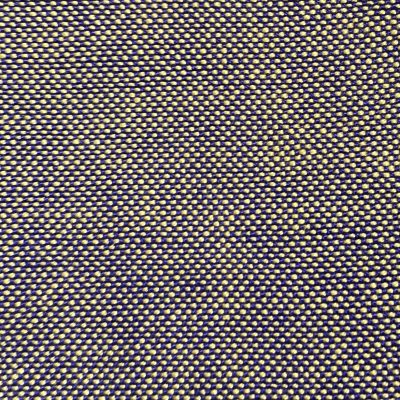
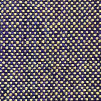
Small-scale patterns blend more than large-scale ones.
Pattern scale affects color blending. All other things being equal, a pattern with small motifs will blend colors together more than a pattern with big motifs. For example, if you look at these two drafts, you can see that the large scale draft keeps the colors clear and distinct, while the colors in the small-scale draft (identical, except for motif size) start blurring and mixing together.

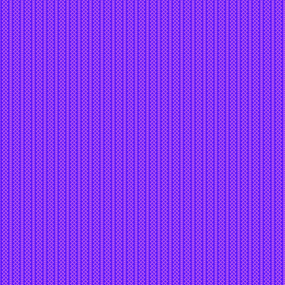
In general, designs with thick, bold lines and large patches of color will blend colors less than designs with thin, delicate lines and fine dots of color.
Yarn size affects pattern size
As you can guess by looking at the two drafts above, yarn size also plays a part in color mixing. Thick yarns increase the size of each dot of color, reducing the amount of color mixing, while thin yarns reduce the size of the color dots, mixing the colors together more closely.
Viewing distance affects pattern size
Less obvious is that viewing distance matters in color mixing. A piece that appears bright and clear close up may blur into muddy brown when viewed from further away, because the design seems smaller as you move further away. This is particularly obvious in fashion show garments or anything else that is seen both close up and at a distance – the difference can be startling.
If you’re designing using weaving software, it’s vital to view your design at the scale it will be when the project is in use. One of the most common mistakes made by weaving designers is to view the draft close up – as you would if editing the threading – rather than to zoom out to the actual size you’d see it at in the finished piece. You may have to zoom out and then walk across the room to get a true idea of how the piece will look! But it’s critical to do this to avoid color surprises.
Summary
So here are the three factors that affect color mixing in weaving:
- Your yarn colors, which provide the basic colors to be mixed together.
- The draft, which controls how much the warp and weft colors are mixed together and where the colors are placed in the finished fabric.
- Short floats that show equal amounts of warp and weft (e.g. plain weave) will blend warp and weft colors together
- Longer floats and floats that are arranged to create warp and weft dominant areas will separate warp and weft colors, keeping those colors bright even if they would normally mix into mud.
- The size of the woven pattern, which is affected by three things:
- The motif size within the draft (small motifs blend more than large ones, delicate lines blend more than bold ones)
- Yarn thickness (thin threads blend colors more than thick threads)
- Viewing distance (patterns appear smaller/colors blend more from further away)
I hope you’ve found this helpful – and remember, you can learn this and lots more by joining the free Discover Color Weave-Along! (Registration is closed; I am now teaching at Handweaving Academy.)
Happy Weaving,

If you want to know more about how to create crisp, clear designs in your handwoven cloth, subscribe to my newsletter and get my FREE e-book! It will help you design beautiful handwoven fabrics, with a pattern as bold or subtle as you want.

