I’ve just finished Seasons of Creativity, my entry for HGA Convergence’s Symphony of the Mountains mixed-media exhibit. Here are a few photos of the finished piece. (The “official” photos haven’t been taken yet, so this is just a quick shot with my cell phone. I’ll post better photos once I have them).
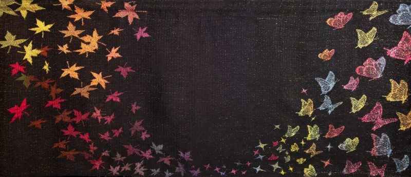
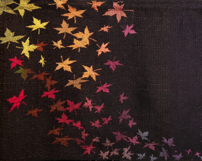
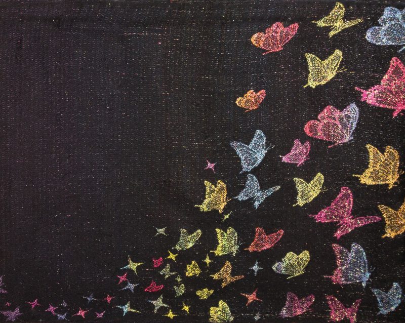
The exhibit’s theme is natural cycles, so I made Seasons of Creativity about the rhythms of the creative process, and how the winding-down of a major project and the start of a new one echoes the rhythms of nature. On the left, the falling leaves represent the maturity and completion of a big project, and the emotional let-down and empty feeling after it finishes.
(Right after I finish a big piece, I always spend a few weeks wandering around the house in my bathrobe feeling depressed, unmotivated, and worrying that I’ll never create anything ever again. Then my spouse laughs at me and says, “You ALWAYS say that!” and brings me back to earth again.)
But during the “fallow period” when nothing seems to be happening, ideas – like leaves – are composting, and eventually the seed of a new idea bursts forth like a little spark. Soon sparks of creativity are flying, and they transform into butterflies. Shortly after that, all sorts of creative ideas are sparking and swarming into a new project, fluttering off into a new creative cycle.
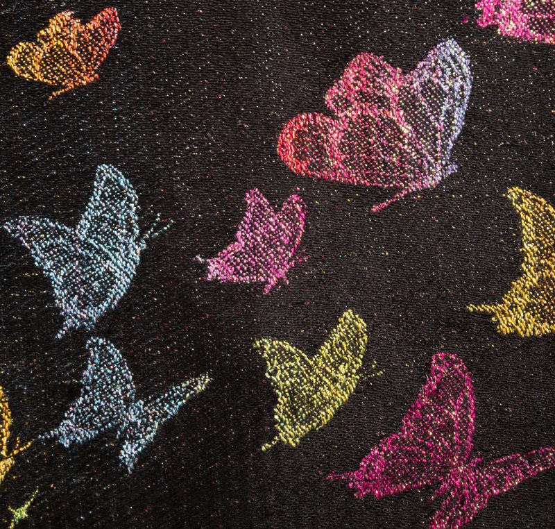
Seasons of Creativity is personally significant for me because for the last four years, I’ve been buried in researching and analyzing color, and creating classes around color. As a result, I’ve had relatively little time or energy to create with color. So Seasons of Creativity is my first serious art piece in just over four years. In a very real way, it’s about my own artistic “fallow period” and the resurgence of my own creative life.
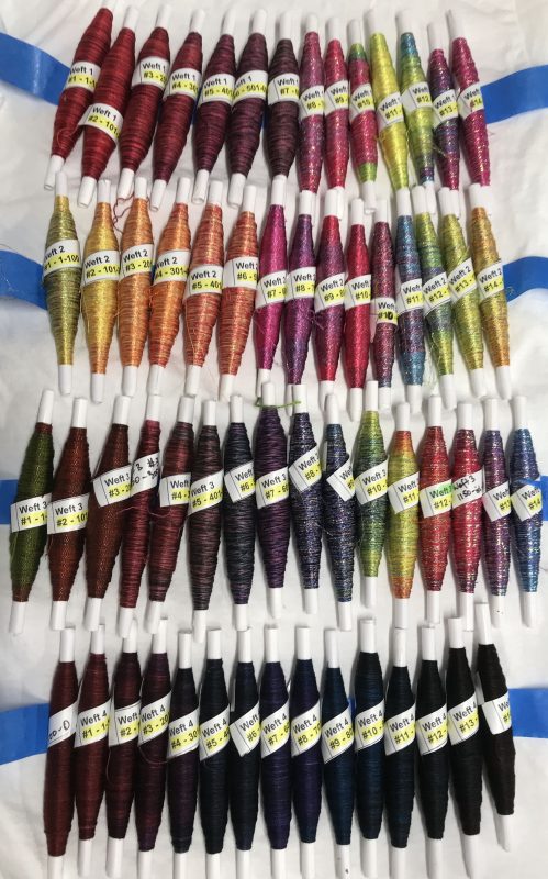
Technically speaking, Seasons of Creativity is pretty complicated. I used 2.66 miles of weft (created using knitted blanks) in a rainbow of colors for the piece – you can read the whole story of its creation in my personal blog. For now, I’ll just give you this lovely behind-the-scenes photo of the hand-painted weft yarns in Seasons of Creativity:
Seasons of Creativity uses many of the design rules I learned while studying color, and that I teach in my color courses. Today I’ll talk about how to catch the eye and move it through a piece.
Here’s another photo of the piece, as a refresher:

Catching the eye
When you look at the piece, your eye will typically start in the top left corner. That’s both because the Western eye usually looks first in the top left corner (most European languages start at the top left of the page), and because I’ve put the color yellow in the top left. The eye is attracted to light colors and saturated colors, and since yellow is the lightest, most saturated of the pure hues, it seizes the viewer’s eye. I’ve deliberately placed yellow there because I want the “visual story” of the piece to start in the top left.
Guiding the eye through a piece
After the eye takes in the yellow leaves, it starts looking for the next most interesting thing. Things that are close by will naturally draw attention first, unless something far away is screaming for attention. In this case, the red leaves are just as saturated as the yellow, and only a little darker, so the eye moves on to the red leaves, and then further down to the brown leaves.
As the colors fade and become less saturated, they also become less interesting to the eye. The leaves also become smaller and less interesting, but by this point the eye has built up momentum along the line of leaves, which keeps it going – albeit more slowly – through the center of the piece, where it nearly stalls out since there is almost nothing to see in the center, except for a few dull-colored leaves and stars. The result is a feeling of void, and a timeless space between the two sides of the piece.
In the center of the piece, though, just as the eye stalls out, I’ve placed a pop of bright color – the first star – to catch the eye and keep it from skipping immediately to the butterflies on the far right. That’s because if the eye gets truly bored – sees nothing of interest – it will skip on to something more interesting.
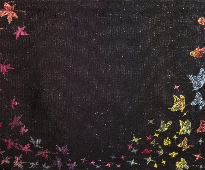
A pop of color catches the eye just as it stalls out in the center.
In order to move the eye along, just as the leaves taper out to dull nothingness, I add a spot of saturated color (and metallic sparkle, which is not visible in the photo) in the form of a single star, then begin increasing the amount of saturated color, and the variety of colors, to continue drawing the eye to the right, until it reaches the end point of the piece, with its exuberant flutter of butterflies taking off into the future.

Summing up: In order to guide the eye through the piece, I started by using a light and saturated color, yellow, to attract the eye to the top left of the piece. Then I created a swooping line of color by putting another saturated (but slightly darker) color, red, next to the yellow, creating a tapering curve that gradually became darker, less saturated, and physically thinner.
Just as the tip of the curve faded to nothingness, I brought it back by adding saturated colors and some glitter. Then I increased the size of the curve, the saturation, and the lightness of the colors – and added a lot more glitter – to continue guiding the eye through to the far right and exit of the piece.
Applying this in handwoven projects
Seasons of Creativity uses a couple of color rules to guide the eye, but the basic idea is pretty simple. The eye doesn’t take in an entire piece at once. It looks at the most attention-grabbing part of a piece first. From there, it scans around for the next most interesting thing, then the next most interesting thing, and so on.
If you put interesting design elements in the eye’s path in the right sequence, like a trail of crumbs, the eye will follow that trail just like a hungry bird.
By choosing and placing your design elements carefully, you can guide the viewer’s eye through a piece, exactly as I did with Seasons of Creativity.
Happy weaving,

If you want to know more about how to create crisp, clear designs in your handwoven cloth, subscribe to my newsletter and get my FREE e-book! It will help you design beautiful handwoven fabrics, with a pattern as bold or subtle as you want.

Tien, this is a piece of ART! Its so beautiful❤️
Kind regards,
Anita
Thanks, Anita! I’m glad you like it. You’ve made my day! 🙂
Your Seasons of Creativity is absolutely gorgeous. I can’t begin to imagine the work that went into designing and then weaving it. While I was reading your post, I believe I saw an error just above the final picture: “and the variety of colors, to continue drawing the eye to the _left_, until it reaches the endpoint of the piece, with its exuberant flutter of butterflies taking off into the future.” I think the “left” should actually be “right” as it draws your eye to the butterflies. It’s an important point that I thought you might want to correct to avoid confusion. Thank you for sharing your color knowledge with us. I’m excited to see more pictures.
Hi Allison,
Thanks! I’m glad you like Seasons of Creativity! And you are totally right about the error – can’t believe I missed that! Thank you for catching that for me, I’ll go fix it right now!
Tien
This is stunning on so many levels. The graphic design, the color progression, the art of each individual component and the complexity of the weave. How I would love to see this in person. Makes me wish I was going to Convergence this year. How will this be used / displayed once it’s home from Knoxville?
A stunning result of your hard work! Thank you for sharing your color knowledge and creativity. How many shafts were used for this?
Hi Patillo,
Thank you! I’m glad you like it!
Seasons of Creativity is not woven on a shaft loom – it’s woven on a jacquard loom, which controls each thread individually. This allows weaving pictures! It’s like having a 2,640-shaft loom. 🙂
How did you weave this? It is beautiful!
Hi Allison,
Seasons of Creativity is woven on a jacquard loom using four painted wefts (this gives it the illusion of more wefts than there actually are). It’s double satin with four wefts – actually pretty complicated technically – you can read the details of the creation process here: https://www.tienchiu.com/tag/seasons-of-creativity/ .
I’m glad you like it! It was a lot of fun to make!
Hi Tien, your work is incredible and beautiful. Thank you for sharing your talent.
I really want to see this piece in person! So I hope I can get to Convergence in 2022. Chance is less unfortunately less than 50/50 at this point. Keeping hopes up though.