One of the curious things about handwoven cloth, particularly painted warps or cloth with large stripes of color, is that it can transform dramatically at a distance. Close up, the beautiful woven pattern, the pattern in your draft, is visible. But from a distance, the woven pattern almost disappears, leaving only the larger pattern of the color stripes or the painted warp.
What’s the mystery? Why does this happen?
Let’s find out.
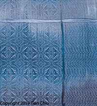
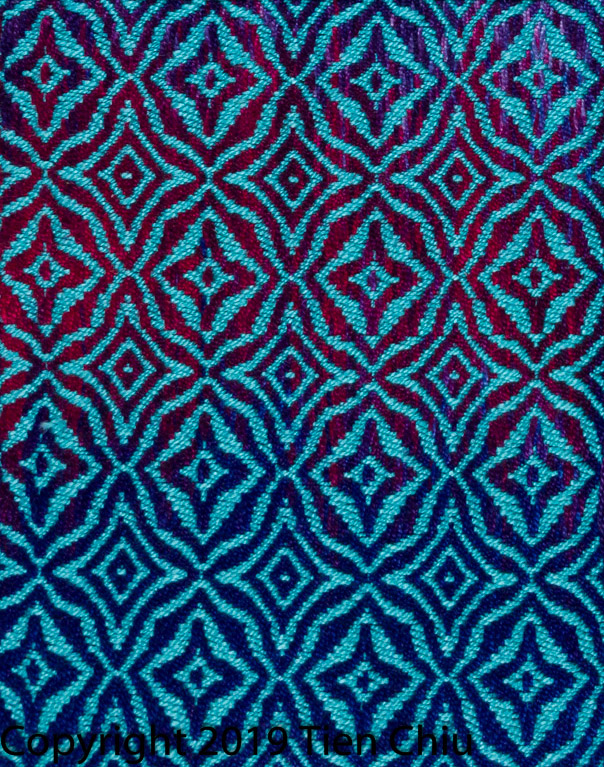
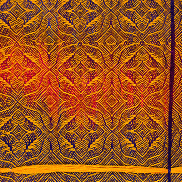
In this painted warp swatch, seen close up, the woven pattern reads loud and clear.
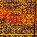
But when viewed from far away (when the pattern would appear very small), the woven pattern becomes much more subtle, and the painted warp colors become the dominant design factor:
What’s happening? Is this magic?
Not at all. It’s your brain and eye doing something called “optical mixing”.
What’s optical mixing? And how does it affect handwoven fabrics?
Optical mixing happens when dots of color are so small that your eye can’t make them out clearly. When that happens, your eye simply averages the dots of color together into a single color. That’s why plain weave, especially in fine threads, often appears to be a single color with a bit of variegation: Your eye is averaging the colors together.
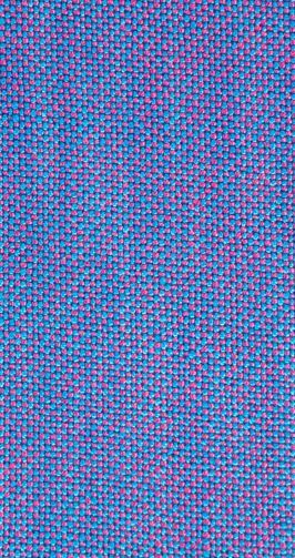
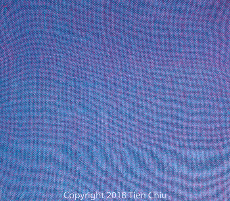
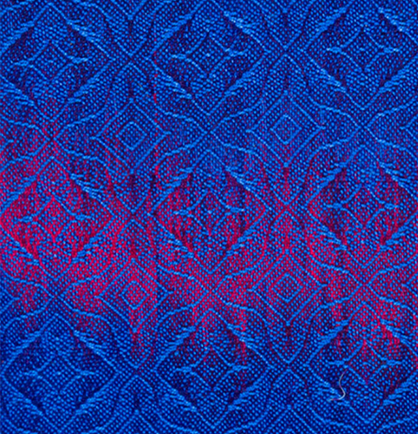
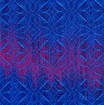
This plain weave swatch of blue and magenta yarns, for example, shows dots of individual colors when seen close up. But when seen at a smaller scale, as from further away, it appears almost solid purple due to optical mixing:
Painted warp patterns dominate at a distance because of optical mixing
In the painted warp swatch at the start of this blog post, the pattern contains a lot of plain weave areas, so is made up of lots of small dots. Close up, those dots are clearly visible, so the eye sees them distinctly and the pattern is clear. But as you move further away from the cloth, the dots become smaller and smaller. Eventually, they become so small that the eye begins to optically mix them with the rest of the fabric, and the woven pattern starts to disappear into the background.
The color pattern dyed into the painted warp, on the other hand, is a very large pattern, so it doesn’t disappear with distance, so as the woven pattern disappears, the colored pattern of the painted warp becomes more prominent.
Stripes of color also dominate at a distance
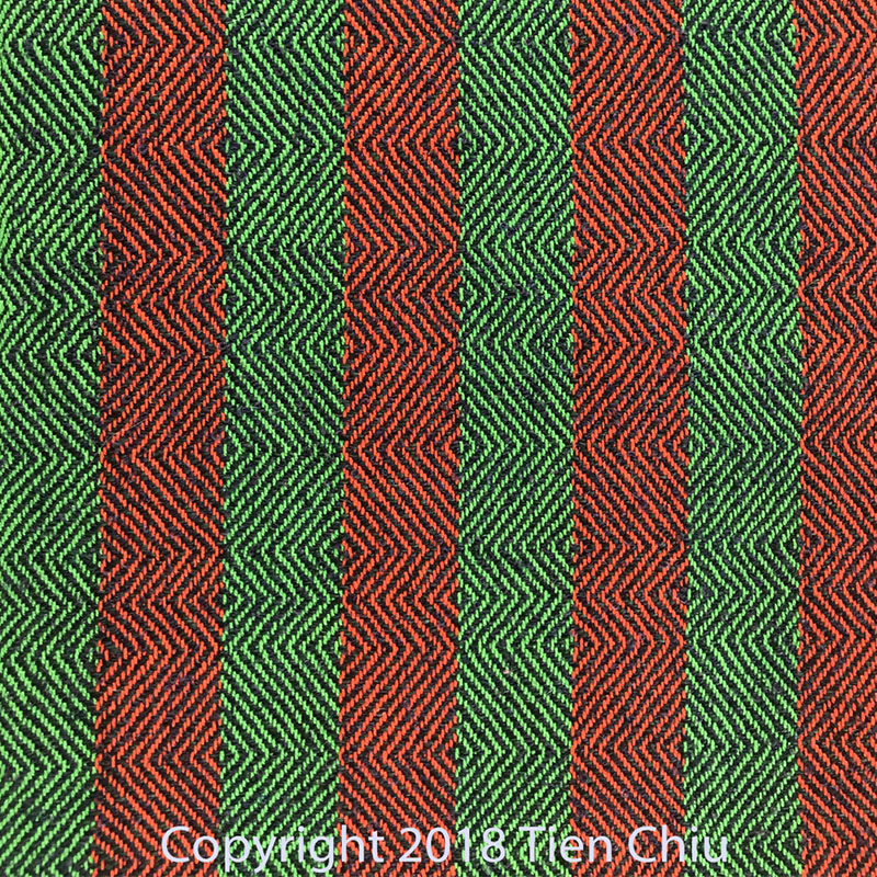
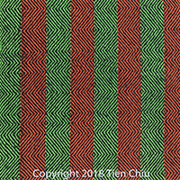
This effect isn’t limited to painted warps. In this striped swatch, the close-up view shows a strong twill pattern:
But from far away, the twill pattern begins to disappear due to optical mixing, leaving only the pattern of colored stripes.
Patterns with small dots disappear more quickly
How far away do you have to be before the woven pattern disappears? It depends how small the dots were in the original woven pattern. Plain weave has the smallest dots and so will average most quickly into a solid color. A draft with large sections of plain weave will disappear much more quickly than a draft with big chunks of solid colors.
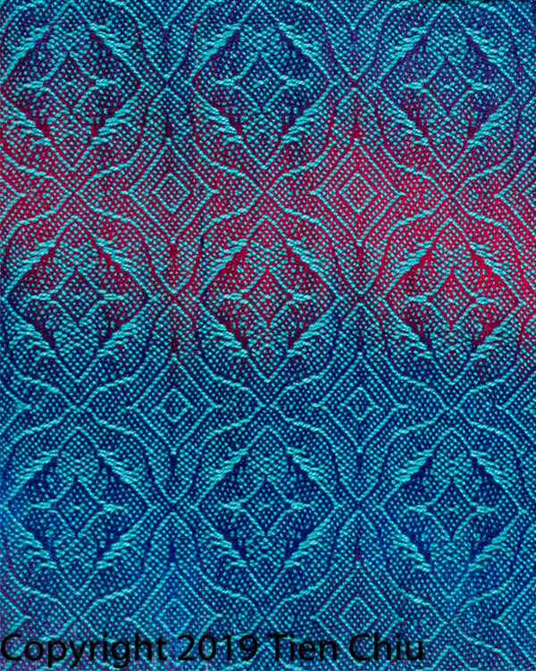
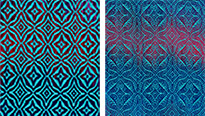
For example, here are two drafts in similar colors and with identical threading and treadling, but using different tie-ups. One has large amounts of plain weave, the other creates large areas of pure color, and creates a much bolder pattern. When zoomed out, the pattern with smaller dots blurs and gives way to the underlying painted-warp pattern much more quickly than the design with larger areas of pure turquoise.
Bolder patterns optically mix more slowly
Patterns that are bolder will generally disappear more slowly. For example, a pattern with strong light/dark contrast, such as this design of bright yellow against dark blue and red-purple, will disappear more slowly than a pattern with low light/dark contrast, such as this design of dark blue against a similar dark blue.
Subscribe to learn how to create bold patterns
For more information on how to create a bold pattern, subscribe to my newsletter for my FREE e-book on how to create bold or subtle patterns in handwoven cloth!
Coming up in my next blog post: How to use what you've learned to design with multiple pattern scales!




Very informative!
Thank you