In my last blog post, I wrote about choosing warp and weft colors to make your pattern show. But what if you are weaving together odds and ends of stash, using an assortment of warp and weft colors, so you have a mishmash of colors?
Here’s how to arrange a mishmash of yarn colors so you see the pattern clearly.
How patterning works in handweaving
The first thing to understand is that the pattern in every piece of woven cloth is actually three patterns mixed together:
- the color pattern in the warp
- the color pattern in the weft
- the pattern of the draft.
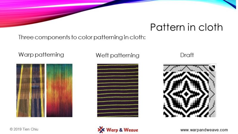
The pattern of the draft determines which of the warp and weft color patterns is on top at any point in the cloth.
If you place one complicated pattern on top of another complicated pattern, then both patterns become harder to make out. It’s very easy to wind up with chaos.
So if your warp yarns are arranged in a bold, complex pattern, then a complicated draft pattern is going to be hard to see because you are putting one complex pattern on top of the other. (The same is true if you arrange your weft yarns in a complex pattern, of course.)
Suppose your warp colors look like this:
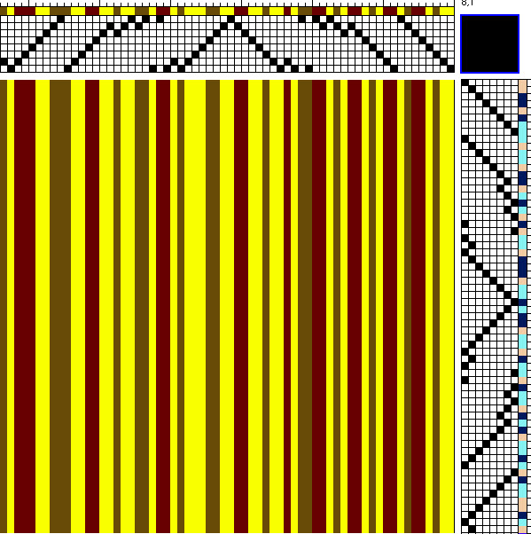
That’s a pretty bold and complex pattern. It’s got a lot of light/dark contrast, which makes it bold. Plus, the stripes are randomly spaced and there are a lot of them, making it look very “busy”.
Further, suppose you use a pattern of weft stripes that looks like this:
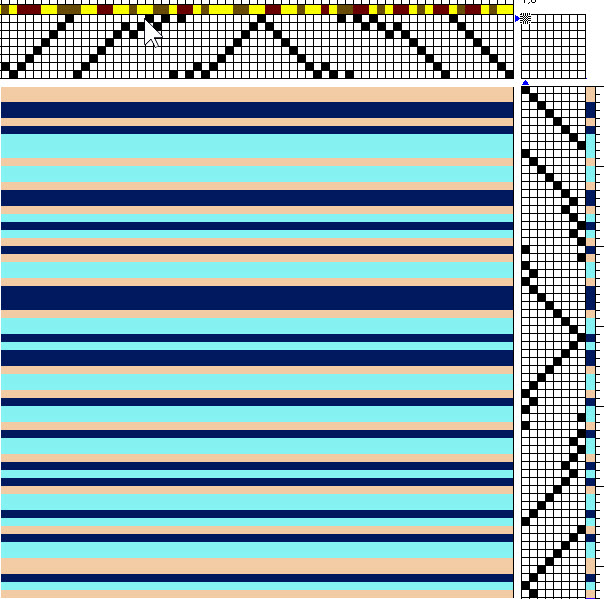
This is also a complicated, bold pattern. Not only is there a lot of light/dark contrast, producing a bold pattern, but the peach and blue are on opposite sides of the color wheel, so contrast strongly in hue. And the stripes are randomly placed, so it looks “busy”.
So, when you put the two patterns on top of each other and combine them in this complicated draft:
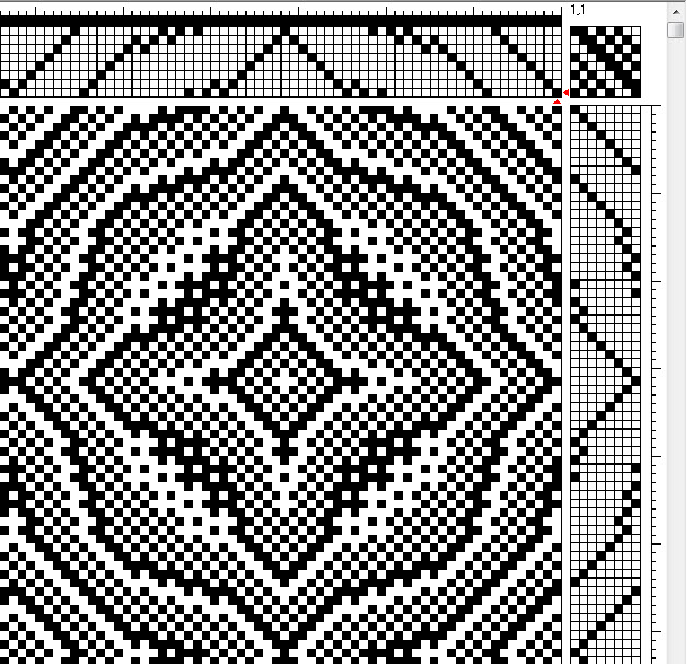
it’s not surprising that you wind up with chaos: you’re combining two bold and complex patterns in a third complicated pattern.
Here’s what you get. The pattern can’t be seen at all!

So how do you avoid this?
Put the light colors in the warp and the dark colors in the weft
Keep the warp light and the weft dark, or vice versa
The most important thing to remember about creating pattern, in weaving or anywhere else, is that practically everything depends on the amount of value – light-dark – contrast in the pattern. That’s because the part of your brain that does pattern recognition only uses luminance – which is to say, it operates exclusively in black and white.
(The human visual system is pretty darn interesting – it turns out we process vision in two physically separate areas of the brain. One of them evolved millions of years ago, with the mammals, and handles things like depth perception, pattern recognition, motion sensing, and so on. Because most mammals don’t have color vision, this visual center – and with it, our depth perception and pattern recognition – operates only in black and white. The other visual processing center evolved much later on, with the primates, and handles face recognition and object recognition, among other things. It sees and uses color. Read more about this in Margaret Livingstone’s excellent book Vision and Art: The Biology of Seeing.)
In the earlier example, the color pattern looked quite bold in warp and weft because both warp and weft contained a mix of light and dark colors. But if you were to rearrange the colors in warp and weft so that the warp colors were all light, and the weft colors were all dark, then the warp pattern would become much more subtle, the weft pattern would become much more subtle, and the draft pattern (which relies on light/dark contrast between warp and weft) would become bolder. Your pattern would then become much more visible.
Let’s see what happens if you switch the colors around.
Here the warp colors were all light colors. Now the “random” warp actually doesn’t look all that complicated to the eye, because all the colors are about equally dark. So to the pattern-sensing part of the brain- which, remember, operates only in black-and-white – the patterns look subtle. Here’s the warp:
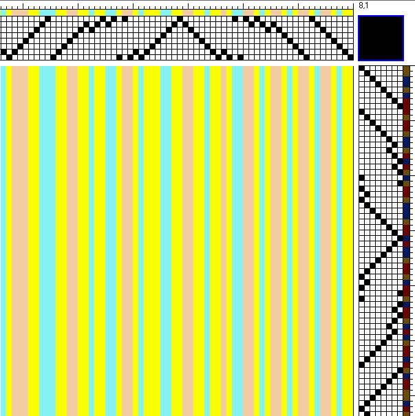
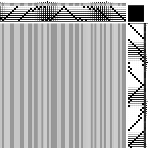
The color pattern is a complex mix of hues (blue, peach, and yellow), but in black and white, it’s actually fairly subtle:
And here’s the weft:
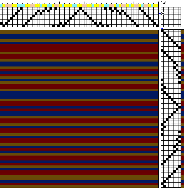
Again, it’s a mix of yellow-brown, blue, and red hues, in a complex pattern. But in black-and-white, where the brain perceives pattern, it’s almost flat gray. So as far as your visual brain is concerned, it’s actually a very subtle pattern.
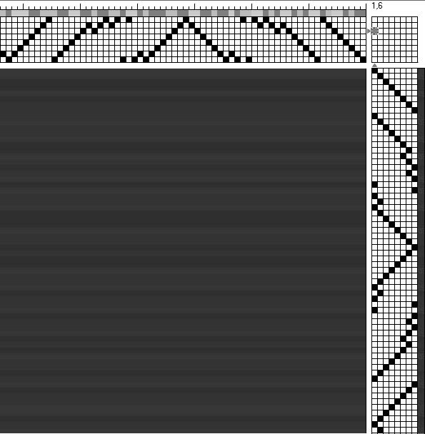
The weft is much darker than the warp everywhere, so when you combine the drafts, the pattern of the draft is much stronger than the pattern of either warp or weft. It shows very clearly:
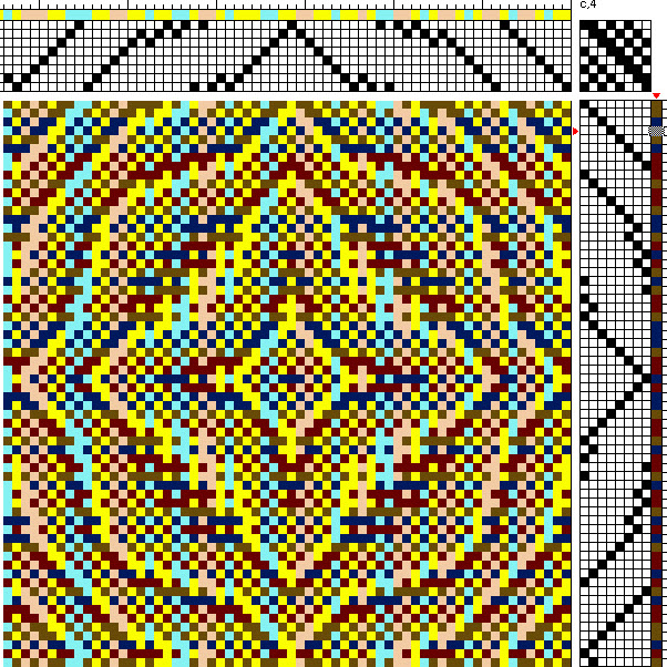
So this is one approach: Rearrange your colors so that the light colors are in the warp and the dark colors are in the weft, or vice versa.
Use wide color stripes rather than narrow ones. Use regular stripes rather than random ones.
The pattern above is pretty visible, but the random threads in the warp are distracting. If you wanted the pattern to show even more clearly, you could simplify the color arrangement in the warp and weft.
If you used wider, more regular stripes, rather than random threads of color, the color pattern would be simpler and interfere less with seeing the woven pattern. That’s because you’d be superimposing a simple color pattern on another simple color pattern, making the combined pattern simpler and less inclined to distract from your draft.
Here’s an example. This draft uses the same colors, only rearranged into wide, symmetrical stripes of color rather than arranged randomly.
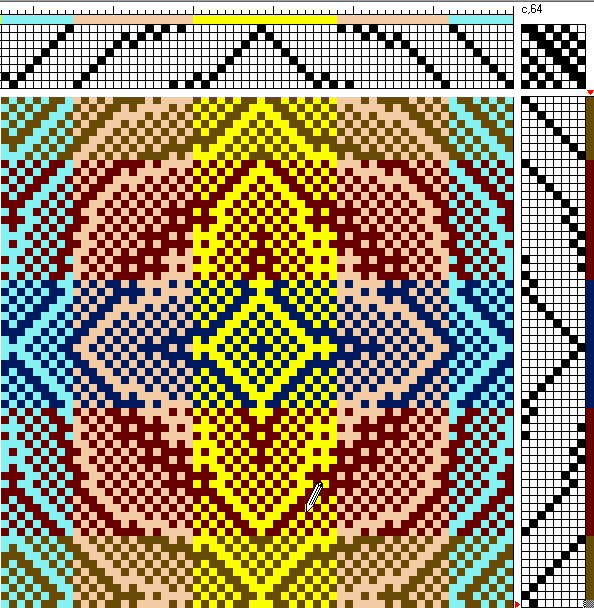
Now the pattern is much clearer and easier to “read”.
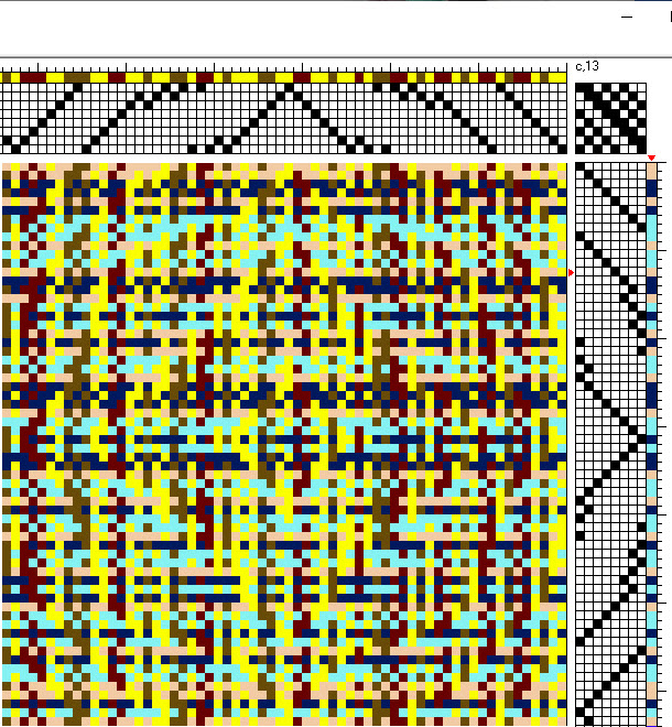
Using stripes will help even if you are mixing values in warp and weft. Here’s what happens if you change from a random mix of yarns to stripes in the previous example of a mixed-value warp:
Random stripes:
Wide stripes:
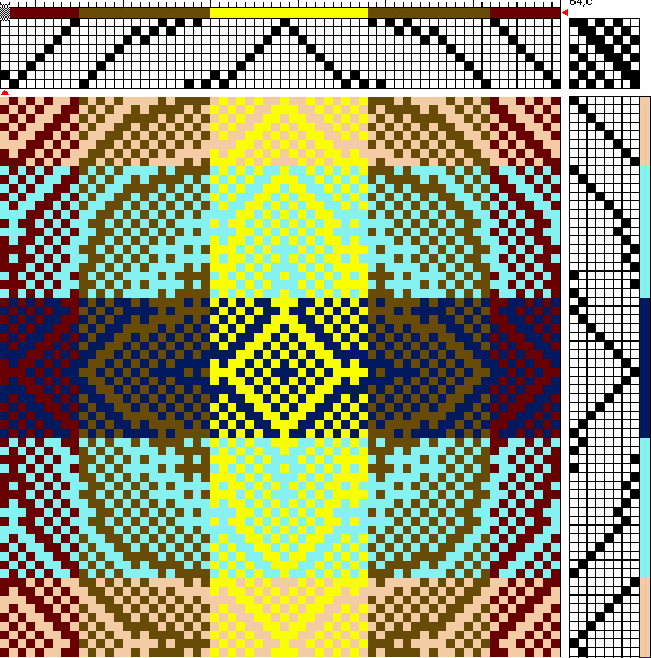
In the second case it is still hard to see the full pattern, but the design looks much more organized and portions are clearly visible – much better than in the randomly striped version.
Even if you are using a completely random assortment of yarns, using what appears – in black and white – to be an organized color scheme will make it easier to see your pattern. For example, using stripes of light colors or stripes of dark colors in warp or weft will make it easier to see your pattern. Using a gradient from light colors to dark colors will also make your cloth look more organized and simpler. The key is to make the cloth look simpler in black and white – then the pattern will look clearer to the eye.
If you aren’t sure whether your warp yarn color combinations look simple in black and white, snap a photo with a digital camera or smartphone and look at it in black and white. On an iPhone, use the Camera app with the Mono filter; on an Android phone, use the BlackCam app (a free version is available) with the Classic filter.
When to use a simple draft
If you have a wide variety of values in the warp and you can’t use wide stripes of color – for example, if you are mixing stretchy and non-stretchy yarns, or thick and thin yarns, and you don’t want to get collapse effects or tension problems, so you are mixing thread by thread rather than in stripes – then you will have difficulty getting a complex draft pattern to show.
In such cases, I’d recommend a simple weave structure such as plain weave or twill, and a solid, neutral weft. That will let you show off the complex color patterning in your warp, without crashing it headlong into another complex pattern in either your draft or your weft.
To sum up:
- The color pattern in woven cloth = the color pattern in warp + the color pattern in weft + the pattern in the draft
- Combining two or more complicated, bold patterns usually results in chaos. So:
If you use a complicated color pattern with lots of light/dark contrast in the warp and/or weft, a woven pattern is unlikely to show clearly. Consider a simpler draft rather than a complex one. - Here’s what makes a color pattern look complicated:
- Colors of very different values (colors that are different in darkness)
- Colors that are arranged irregularly and/or in short repeats.
- If you want to see your draft clearly, keep your warp and weft color patterns subtle and make your draft bold. To do this:
- Use only dark colors in your warp and only light colors in your weft, or vice versa
- Preferably, use wider stripes rather than thin stripes or random placement of individual threads in your warp and weft colors.
Happy weaving!

If you want to know more about how to create crisp, clear designs in your handwoven cloth, subscribe to my newsletter and get my FREE e-book! It will help you design beautiful handwoven fabrics, with a pattern as bold or subtle as you want.


Thanks so much for your really helpful post, and also, for your continuing research on colour.
Thanks!
This also indirectly addresses my concern with different-fiber yarns. I need to keep to very narrow bands of color.
I may have been able to learn these design concepts by making all of these mistakes, but I’m really grateful for the explanations as to what makes them happen. Now I feel a strange compulsion to push the limits of these guidelines; how to step right up to the edge of mishmash, but still come away with something that is not a mess, and even possibly attractive.
I love this! Pushing the edge is a wonderful thing to do; that’s how you learn where the edge is!
I thought you were including the recipe for the chocolate bars!! ?
Love, love, love your weaving and help!!
This was a very informative post.
After several years of not weaving I am enjoying this with a rainbow warp and navy weft and appreciate your tips.
Gracias por su aporte, realmente es muy clara su explicación