How do you weave projects that really stand out, that draw attention to themselves? Or, conversely, how do you weave elegant, understated pieces?
The answer, usually, lies in the third basic characteristic of color: Saturation.
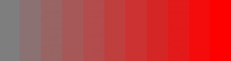
Saturation is the intensity of a color – its dullness or brightness. This picture shows the range from a very low-saturation gray to a very high-saturation red:
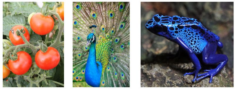
In nature, saturated colors typically don’t happen by accident; they happen because a creature is using them to signal something. Generally, that’s food, sex, or danger:
As a result, our brains are programmed to pay attention to saturated colors. Given a choice between looking at a saturated color and a non-saturated color, we’ll look at a saturated color first.
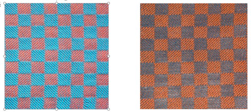
For example, the two swatches below are both orange and blue. But because the left swatch is made up of very saturated colors, while the right swatch is made of less saturated colors, the left swatch is much more attention-grabbing than the right swatch.
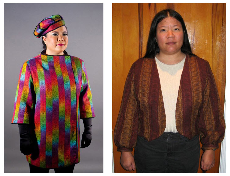
Similarly, given the two people below, the viewer will look at the person in the high-saturation left-hand garment before the low-saturation right-hand one! (And neither of those choices is bad – it all depends on whether you want to be the center of attention at the party, or whether you want to enjoy a nice quiet evening.)
Since the eye is drawn to saturated colors, when you are designing your project, put your saturated colors where you want people to look.
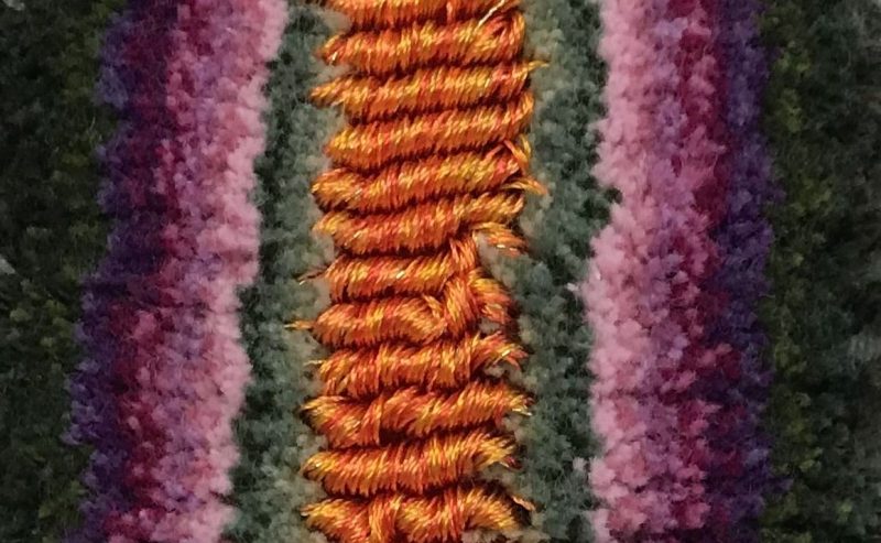
In this sample of handwoven velvet, the luminous orange loops of pile in the center are by far the most saturated colors in the swatch, instantly drawing the eye to the orange stripe.
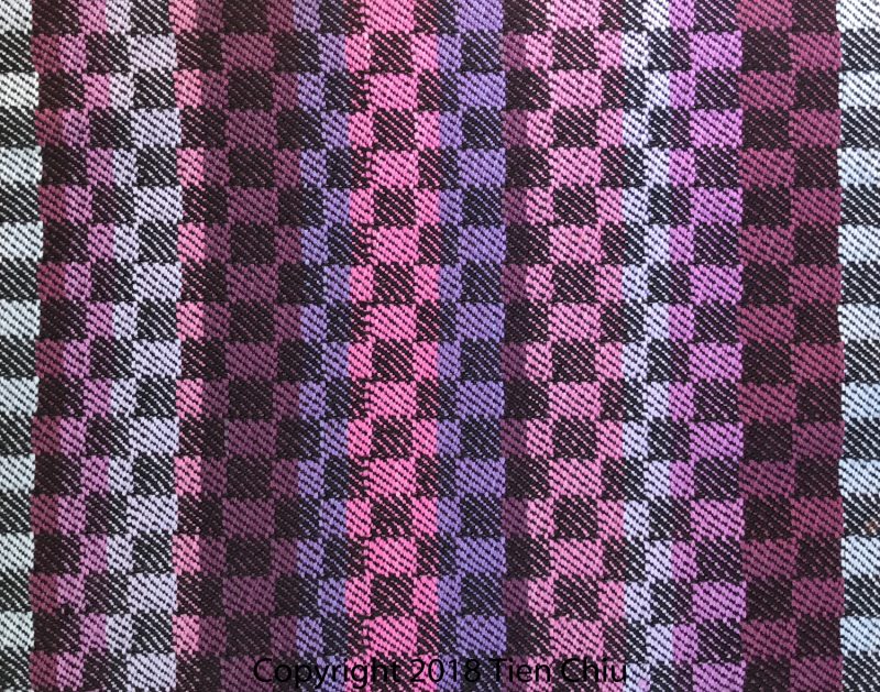
In the striped swatch, the eye is drawn to the saturated pink stripe near the center of the swatch.
Often just a splash of saturated color is enough to draw the eye, especially if that color is yellow. (Yellow is the most dominant/aggressive color in the palette.) Even a few threads of yellow, or its neighbors yellow-orange or yellow-green, can be enough to add interest to a piece of fabric or draw attention to a particular spot.
If you’re concerned about adding too much of a bright color to an entire piece, consider using inlay, or adding an embellishment or embroidery to create just a spot of color.
Saturation is probably the least-discussed of the three characteristics of color (the other two are hue and value), but it’s an extremely powerful one. In nature, creatures use it to get our attention. In designing, use it to grab attention and draw your viewer’s eye to the things you want people to see.
Happy weaving!

If you want to know more about how to create crisp, clear designs in your handwoven cloth, subscribe to my newsletter and get my FREE e-book! It will help you design beautiful handwoven fabrics, with a pattern as bold or subtle as you want.
Thank you Tien
How generous of you to share this article on saturation of colours with us.
Your examples explains it very well.
Thank you
Thank you so much,
I am definitely going to put this into practice as it makes total sense to me – yusss