This blog post is an excerpt from my “Discover Color Weave-Along” course – if you find it useful, you can buy the course. Registration is closed; I am now teaching at Handweaving Academy.
The eye works according to logical principles, hardwired into us by years of evolution. As a result of those years of evolution, we pay attention to some colors (and patterns) more than others, and knowing which colors and why lets us use these principles in design.
Saturated colors draw the eye
The eye is drawn to saturated colors – “bright” colors, like cherry red or emerald green, as opposed to duller colors like brown or maroon. That’s because in nature, saturated colors, particularly reds, yellows, and oranges, often signal food (or sometimes danger).
So, if you want to draw the eye to a particular area of your piece, put a brilliant color there and dull colors elsewhere.
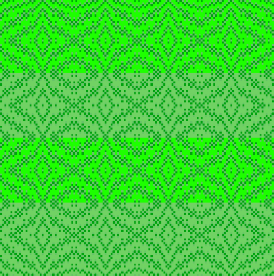
In this draft. the hues are the same – green – and the stripes are about equal darkness. But your eye is drawn to the bright green stripes over the duller green stripes, because they are more saturated (brighter).
Light colors also attract the eye
Light colors also draw attention, because – all other things being equal – your visual system thinks that light-colored objects are more brightly lit and therefore either closer to the light (and likely us) than darker colors, or at the top of a pile of objects (i.e. not in shadow). This makes them more interesting, because things that are on top or closer by are more accessible to us than things that are far away or at the bottom of a crevasse!
(This rule applies to close-by objects, not faraway ones. But unless you are a tapestry weaver doing landscapes, the reverse effect at great distances is unlikely to be an issue for you.)
You can see this effect at work in these two painted-warp swatches. In the swatch woven with black weft, the darker black squares appear to be beneath the lighter-colored squares, which “float above” the black squares. In the swatch woven with white weft, the darker-colored squares appear to sink below the lighter white squares, which look like they’re in front.
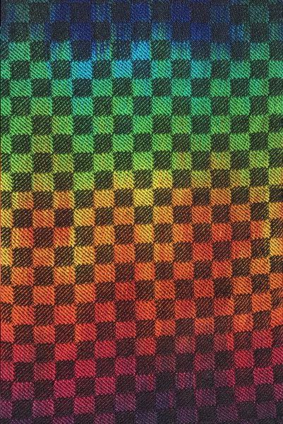 | 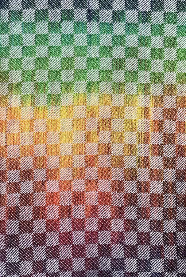 |
As a result of the three-dimensional illusion, in the painted-warp swatches, the black weft allows the painted warp to take center stage, while the white weft attracts attention away from the painted warp, which “hides behind” the white squares. This is why darker colors are better to use as weft when you want to showcase warp colors – they “sink beneath” the warp color, rather than floating above and distracting from it.
Around the color wheel: Different hues
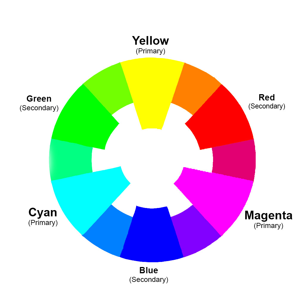
Because saturated (bright) colors are used so often, I’ll talk a little about saturated colors.
Of the “pure” colors, yellow is the most eye-catching color because it is both very saturated and very light, so it draws attention more powerfully than any other color.
Yellow-orange and yellow-green are right behind yellow in saturation/lightness, which is why all three colors can be challenging to use. They draw attention strongly, so even a little bit can easily overpower other colors. ‘
As you get further from yellow on the color wheel, colors become less assertive. Blue sits opposite yellow on the color wheel and is the darkest of the pure (most saturated) hues, making it the least assertive of the pure hues.
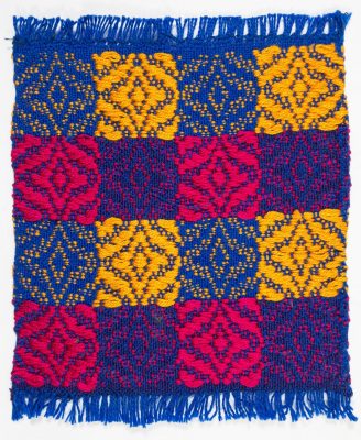
In this mug rug, the yellow squares are much lighter than the magenta-red squares, so attract attention much more strongly even though both colors are very saturated. Both yellow and magenta attract far more attention than the blue squares.
The key to using yellow and other very strong colors is to use them in small doses, and balance them out with larger amounts of other colors – or to spread them out in small doses across an entire piece, diffusing their power. I talk about this in this Warp & Weave blog post.
What if one color is highly saturated but dark (sapphire blue) and another is lighter but not very saturated (dusty rose)? Which will attract more attention?
It’s hard to answer those questions in the absolute, as other factors come into play – things like contrast, patterning, and other things also affect how much attention an area attracts.
It’s more useful to think of saturation and value (lightness/darkness) as knobs to turn. If you want one area of a piece to attract more attention, crank up the saturation or make the colors lighter in that area. If you want it to attract less attention, make the colors darker or duller.
Those are just two knobs you can turn; there are others. Find out about them in Discover Color! Registration is closed; I am now teaching at Handweaving Academy.
Happy weaving,

If you want to know more about how to create crisp, clear designs in your handwoven cloth, subscribe to my newsletter and get my FREE e-book! It will help you design beautiful handwoven fabrics, with a pattern as bold or subtle as you want.