How do you choose colors and weave structures to create “mood” in handwoven fabric?
Imagine for a moment that you’re looking at a project in a weaving magazine. You like the overall design, but you don’t like the colors! You want to make something more colorful – something with cheerful pizzazz. Or maybe you want a more subtle version – elegant and understated.
This blog post will help you choose colors and weave structures to get the results you want.
What determines the mood of your handwoven cloth?
The emotional “feel” of a fabric is created mostly by three factors: Drama, energy, and darkness.
Drama in handwoven cloth
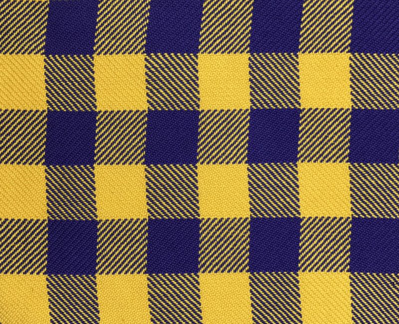
The amount of contrast in a piece determines its level of drama. Large patches of strongly contrasting colors – yellow and navy blue, for example – will create a high-contrast, dramatic design:
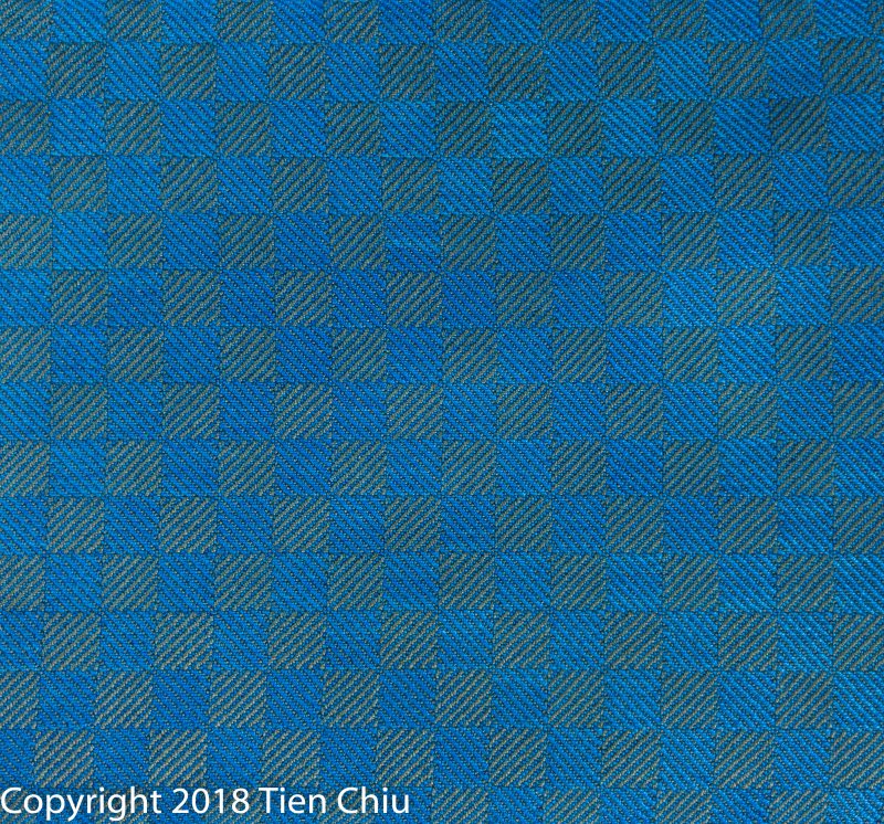
Colors that are very similar, on the other hand, will create a subtle design:
Creating drama: Value
In the first sample, the yellow contrasts strongly with the dark blue for two reasons. First, yellow is a light color, while navy blue is very dark. Light/dark contrast is the biggest contributor to drama in a piece – the higher the contrast, the more dramatic the piece.
In the second swatch, there is little to no difference in darkness between gray and medium blue, and no hue contrast since gray is a neutral color. As a result, the pattern has little drama, producing a subtle pattern.
(Read more about this in my blog post “Why Bright Colors Weave into Dull Handwoven Projects – And How to Fix It”.)
Creating drama: Hue
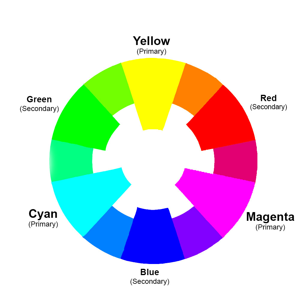
The second form of contrast is hue contrast. (Hue refers to the color family – red, green, orange, etc.) Yellow and blue sit opposite each other on the color wheel. The further apart two colors sit on the wheel, the higher their hue contrast.
So blue and purple, which sit next to each other, have little hue contrast, while yellow and purple have high contrast.
Creating contrast through weave structure
The amount of contrast in handwoven cloth depends mostly on two things. The first is the draft for the cloth. If you use high-contrast warp and weft colors, drafts that place large warp-dominant areas next to large weft-dominant areas will produce high-contrast cloth. The larger the patches of color, the more clearly the design will show.
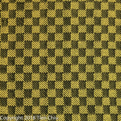
Here are some examples of high-contrast structures: Twill blocks, monk’s belt, summer and winter in large blocks, and stripes of 1/3 vs. 3/1 twill. These drafts place large areas that are mostly one color next to large areas of a contrasting color.
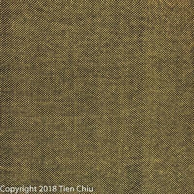
Drafts that blend warp and weft in the same proportions throughout, with small dots of color, will produce evenly colored cloth with little value contrast regardless of what colors you use. Examples include plain weave, most lace weaves, and short-float twills, such as the 1/2 twill commonly used for jeans.
To illustrate the profound differences weave structure can make, here are two pieces of cloth woven using identical yarns, one yellow and one black. The first one is woven in plain weave, a low-contrast structure; the second is woven in twill blocks, a high-contrast structure.
If you’d like to understand more about why structure matters, there’s a longer explanation in my blog post “How to Use Black to Give Your Handwoven Fabrics Pizzazz”.
Design scale affects contrast
The scale of a design also affects the drama of your handwoven cloth. With any draft, bigger yarns will weave into bolder patterns than fine yarns, because the patches of color are bigger. You can see this clearly in these two samples. The top sample is woven in 120/2 silk (30,000 yards per pound), at 96 ends per inch. The bottom sample is woven in a much thicker silk yarn (2,500 yards per pound), at 24 ends per inch. The large yarns in the bottom sample create a much bolder design than the small yarns in the top sample.

If you’d like to learn more about the effects of scale on color, and how to design at the correct scale for the effect you want, read my blog post “How to design handwoven cloth that looks good at any distance”.
There is no such thing as a “correct” level of drama; sometimes you’ll want a subtle pattern, sometimes you’ll want a dramatic one. But understanding contrast allows you to choose the right drama level for your project.
Energy in handwoven cloth
The second factor in mood is the energy of the colors. Energy comes from two components: Saturation and warmth of the color palette in your finished handwoven cloth.
Saturation
Saturation refers to the brightness of a color. Brilliant colors produce an energetic feel. Duller, more subdued colors produce a calmer one. (Think “Fiestaware” vs. tableware in natural grays and browns.)
The image below illustrates the effects of saturation. The left side is completely desaturated – plain gray with no hint of red. The saturation of each rectangle gradually increases as you travel to the right. The final rectangle, on the far right side, is fully saturated – brilliant red.
As you can see, the bright red rectangle “feels” much more energetic than the gray one:
In general, the more saturated the colors in your finished cloth, the more energetic that cloth will “feel”. Less saturated colors produce a calmer, understated effect. Choose whatever energy level is appropriate for your project – there’s no right or wrong.
The two samples below show the effects of saturation. In the first sample, the warp is royal blue and the weft is olive green, producing a rich cloth with a stately feel. The second sample uses a dazzlingly bright lime green weft, producing cloth that could be called “jazzy” or “blinding,” depending on how you feel about bright colors.
The warp color and the draft are the same in both samples; only the weft is different.
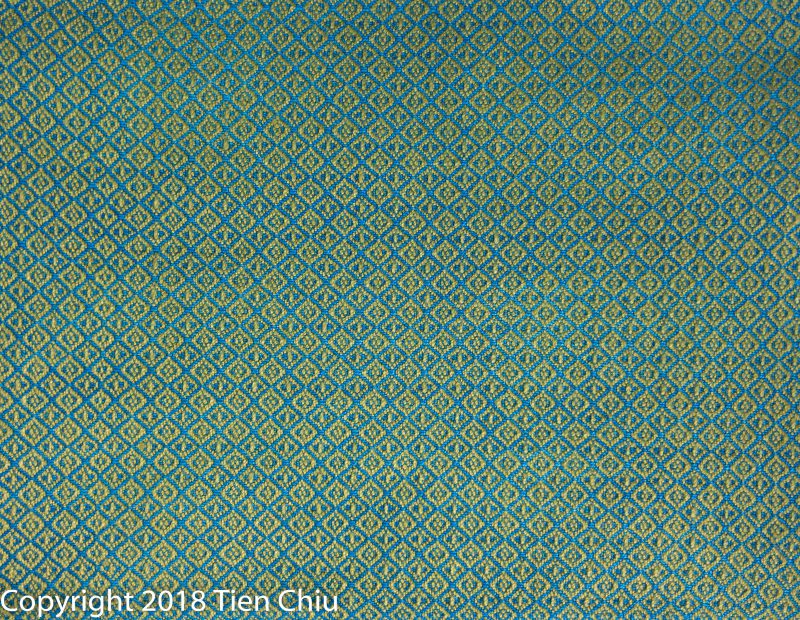
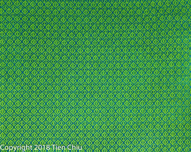
It’s important to note that using bright colors will not necessarily result in a bright-colored piece. Blending two colors that are far apart on the color wheel can produce a dull color. For more about how to blend colors (or keep them separate), read my blog post “Are your bright colors weaving into mud? Here’s how to fix that.”
Warmth
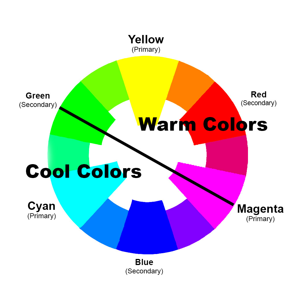
The warmth of the colors in your finished piece also affects the energy level of your finished piece. Colors between yellow-green and orange-red on the color wheel are generally considered “warm” colors. Except for yellow-green, these are the shades we typically associate with fire: yellow, orange, and some reds. The eye is strongly drawn to warm colors; as a result, they can easily dominate a piece. Warm colors have lots of energy.
Colors between blue-green and purple are generally considered “cool” colors. The eye is less drawn to cool colors; they are often considered “restful” and “calm,” relative to the warm colors.
Opinions on green and magenta (and sometimes red or purple-red) differ; some color wheels assign them to the warm side, some to the cool side, or consider them in between. Truthfully, the exact nature of a color isn’t that important; what’s important is its relative warmth- whether it’s warmer or cooler than the others around it.
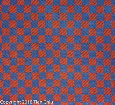
Because the eye is drawn to warm colors, they tend to look closer than they actually are. Similarly, cool colors tend to look further away. This can create visual illusions where warm colors “advance” to the front and cool colors “recede” to the back. In the sample below, the cloth is flat, but orange is warmer than blue, so the orange blocks look like they’re on top.
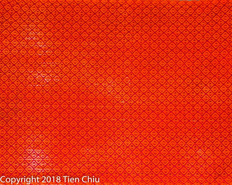
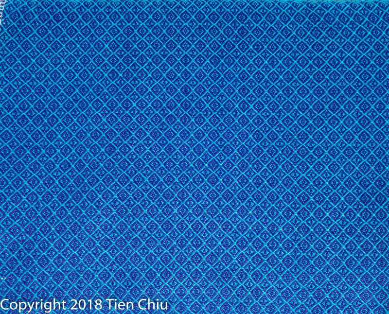
Because warm colors excite the eye, cloth that is mostly warm shades will feel more energetic than cloth that is cooler shades. In the two samples below, the red and orange cloth blazes forth, while the blue-purple and turquoise cloth feels much calmer.
Setting the mood: Darkness
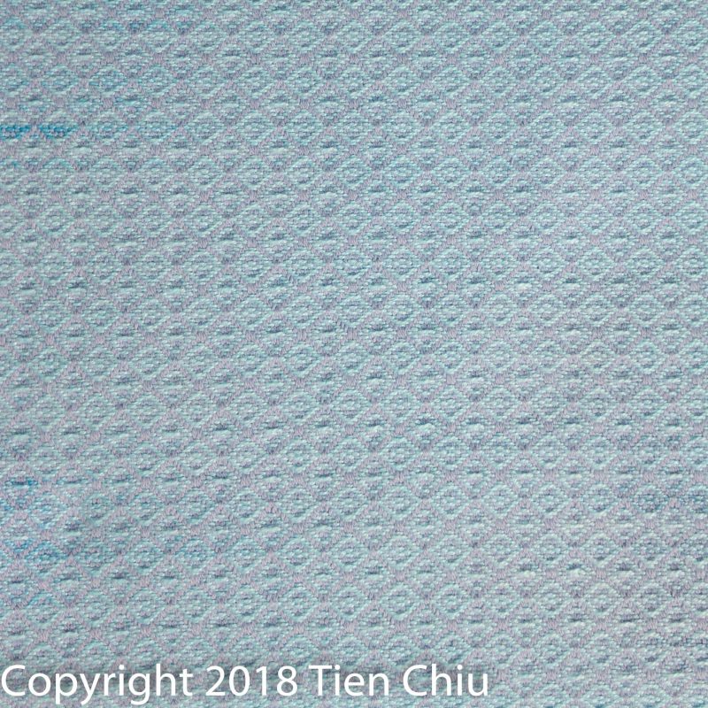
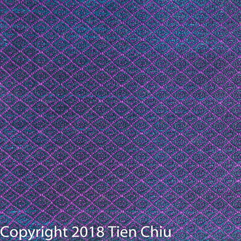
The final factor in determining the mood of your piece is the overall value – the lightness or darkness of your fabric. Cloth that is mostly pale colors will generally have a light, airy feel. Cloth woven in dark colors has a more somber or stately feel. Colors of medium darkness can give a wide variety of moods.
In the samples below, the pale fabric gives a calm, meditative feel; the darker fabric feels more weighty and regal.
Summary
- Drama, energy, and darkness determine the mood of your handwoven cloth.
- Drama is the amount of contrast between colors in the finished piece (which may be different from the contrast in your palette)
- Light/dark contrast matters the most, followed by hue contrast.
- Weave structure controls color blending. Structures that blend warp and weft evenly (e.g. plain weave or huck lace) will always produce subtle patterning. Structures that put warp-dominant areas next to weft-dominant areas (such as twill blocks or blocks of summer and winter) can produce higher-contrast designs.
- Scale also matters. The smaller the scale of your handwoven design, the lower the contrast.
- Energy depends on how saturated (bright/dull) the colors are in your finished cloth, and how warm/cool the colors are.
- Darkness of the finished cloth affects mood as well, though less than the other factors. Light colors give an airy or meditative feel; dark colors create a more sober feel. Medium colors can give a wide range of moods, depending on the amount of drama and energy in the palette of the finished piece.
If you want to know more about how to create crisp, clear designs in your handwoven cloth, subscribe to my newsletter and get my FREE e-book! It will help you design beautiful handwoven fabrics, with a pattern as bold or subtle as you want.
Happy weaving!
– Tien


Clearly stated and lovely samples! Thanks once again for a great blog post.
As I read it, it all makes sense. But when I try to apply it in ‘real’ weavings it’s like …..oh dear….help !
Beautiful and informative post. Thank you. I am always disappointed when I make mud with projects I want to be bright and clear. Between this and a couple of your other posts I have a MUCH better understanding of the principles behind color play than I did previously. Thank you for sharing your knowledge!
One question on the blue/olive and blue/lime samples– The blue looks different in the two samples, more of a sky blue in the olive sample, and a navy in the lime. I’m willing to believe it’s my eyes playing tricks on me– certainly I’ve had that experience with weaving! My impression, though, is that the photos may not be true to life. I shared with my housemates and they were both convinced the blues were different.
It might be more persuasive to see the two samples in the same photo, where it’s obvious that the photograph isn’t distorting reality. I know how hard it is to get photos that reproduce color accurately! I assume you have created a photo library so it’s not a trivial task to re-photograph things for every post, but perhaps if the samples were photographed against a white card rather than in full frame they would be more visually persuasive.
I don’t know the answer, just providing feedback as requested. 🙂
It’s definitely the same blue – the two samples were woven on a painted warp, but on successive sections. And the two photos were taken using color-correcting equipment/software to make sure the colors are correctly represented. But the blues do look different – because colors can strongly affect the appearance of neighboring colors. (Hmm, I think I need a post about that!)
Good idea for re-photographing the samples side by side. Next photo session I’m going to do that…thanks!
Very interesting reading. I need to practice colour use. Sometimes I’m surprised by how two colours that I like on their own, can cause a dull effect when woven together. Thank you for the information.
I’m curious about the color wheel you use. Can you tell me the source? I’m accustomed to the artists’ color wheel, in which red and blue are primaries, and magenta and cyan are not included.
This was a very useful article, thank you.
Hi Debra (and sorry for the delay in responding!),
Yellow, magenta, and cyan are the primary colors for most subtractive (physical media) color mixing. Red and blue, it turns out, aren’t actually primaries – red is roughly a 50-50 mix of magenta and yellow, and blue is a mix of a lot of cyan (turquoise) with a little bit of magenta. The red-yellow-blue color wheel doesn’t produce as wide a range of colors (purples and greens in particular tend to be duller than with the yellow/magenta/cyan primary set).
Lots more useful information about this on Wikipedia: https://en.wikipedia.org/wiki/Color_mixing
Thank you for this helpful information! Do you ever work with tools such as colored pencils, etc., to work out colors before moving forward with a warp? Thanks!